Steve Jobs' legendary product launches had an unmistakably theatrical air. For Apple fans, part of the thrill of seeing a new Mac instrument unveiled was the chance to admire its sleek design (take, for example, the moment in 2008 when Jobs liberated a razor-thin MacBook Air from its innocent-looking manila envelope).
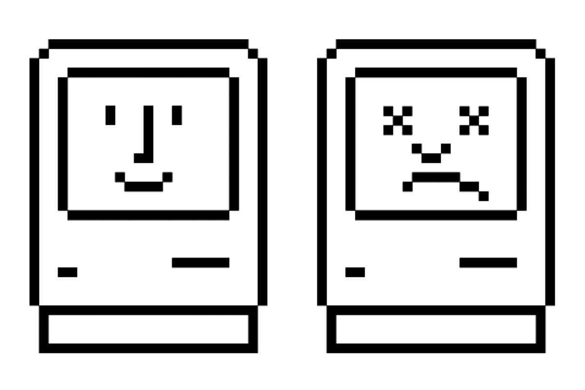
While early Macs were boxier and more primitive than their hyper-evolved modern counterparts, good design -- on-screen and off -- has always been central to the Apple mystique. That's where Susan Kare, the artist who invented many of Mac's most enduring symbols, comes in. Kare is the architect of early Apple iconography -- the designer who brought us, among so many other recognizable signs, the wristwatch waiting icon and the command key symbol (based on a symbol used on Swedish maps).
A new, self-published book (available online) shows off some of Kare's most recognizable work (including more recent projects, like Facebook's popular digital "gifts") -- and resurrects other designs that have been phased out of Apple computers' virtual image lexicon. Over email, Kare answered some of our questions; the following slide show offers highlights from her portfolio (with captions adapted from her book).
How did you first get involved with Apple?
My friend from high school, Andy Hertzfeld, encouraged me to interview at Apple for a part-time job to design fonts (mainly) and other images for the Macintosh. I didn't have any experience with computers, and couldn't find research material about digital fonts per se, but figured I could work from traditional fonts displayed in books.
How unusual was it, at the time, for a computer company to hire a professional artist? Do you think this is something computer companies do a lot more often now?
I can't really generalize, but I was the only graphic artist in the Mac software group (the title on my business card was "Macintosh Artist"). Of course, it seems more common for development teams to include artists now since so many user interfaces are graphical (and I'm always impressed with the art made by the Google Doodle team).
In the beginning, how long did the design process for a single icon take?
This varies, because for some of the icons (e.g., a pencil for "write") there is one obvious solution where alternatives were probably mocked up within a day. Others (e.g., "fill") took longer because multiple candidates were created and circulated, and leading contenders were shown in the software in progress.
What do you think the most effective and lasting computer icons accomplish? Has this changed over time, as design technology has improved?
A great icon clearly conveys a concept at a glance, is not ambiguous, and is memorable. I think that the basic design challenge remains unchanged, though certainly technology advances provide more potential avenues of expression (more color, more resolution, sound, animation, etc.).
Your early, heavily pixelated Mac icons are markedly different from some of your more recent, smoother designs (e.g., the Facebook gifts). Is this because of the way technology has progressed over the years, or simply because you're trying for a different look?
In any job we do, we first consider the design or marketing goals along with any technical limitations or requirements.
For the Macintosh, most symbols were monochrome, needed to fit within a 16 x 16 or 32 x 32 square pixel grid, and were shorthand for computer functions.
For each Facebook gift, there was a 64 x 64 pixel canvas with virtually unlimited color. The challenge was to create images desirable enough or affecting enough or amusing enough to encourage potential gift givers to spend a dollar to enhance a message. The gifts functioned as small greeting cards, rather than digital road signs. Some gifts were more iconic and some more illustrative, but detail in this case did not impede understanding.
How closely did you get to work with Steve Jobs? What did you understand his aesthetic philosophy to be?
I was fortunate to work with Steve at Apple and at NeXT on a variety of projects. He checked in almost daily on the Macintosh graphics-in-progress. Later, at NeXT, we worked together on the identity and branding, and on a variety of publications and slide shows. He would constantly iterate on the content of his presentations, slide by slide. At that pre-PowerPoint era, there was a lot of handwork in making slides, and builds could require many exposures. He might revise a single slide 14 or 15 times. I learned a lot about the cumulative value of attention to detail from Steve, and about pushing the limits of a medium. I still think of his philosophy of not showing too much information all at once, and the value of simplicity in visual messaging.


Shares