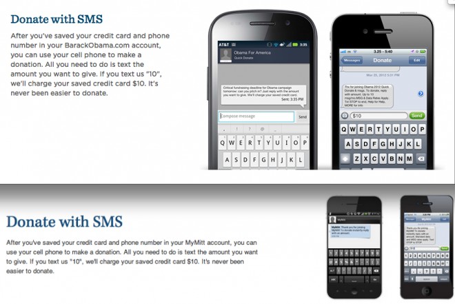
After months of telling Democrats that they didn’t build that, the charge may be ironically accurate when it comes to Mitt Romney’s website. The Romney campaign’s “victory wallet” donation page bears a striking resemblance to the Obama campaign’s “quick donate” page. The Obama campaign published its in March and Romney’s site went up in late August.
Both sites display three options to donate, the text beside each identical. For example, on the Obama campaign’s “Donate With SMS” section:
After you’ve saved your credit card and phone number in your BarackObama.com account, you can use your cell phone to make a donation. All you need to do is text the amount you want to give. If you text us “10”, we’ll charge your saved credit card $10. It’s never been easier to donate.
And the “Donate with SMS” section from the Romney site:
After you’ve saved your credit card and phone number in your MyMitt account, you can use your cell phone to make a donation. All you need to do is text the amount you want to give. If you text us “10”, we’ll charge your saved credit card $10. It’s never been easier to donate.
Note they even have the same grammatical error — the comma outside the quotation mark after the 10.
The layout of the sites is identical, with “donate by web” followed by “donate by email” followed by “donate by SMS” sections on both. Even the clip art is similar.
The Terms of Use of the Obama campaign states that the website, “including, without limitation, OFA’s logo, and all designs, text…are the proprietary property of OFA or its licensors or users and are protected by U.S. and international copyright laws.”
Democratic digital consultant Matt Ortega, who first pointed out the similarity on Twitter (BuzzFeed also reported it), said, “The sheer hubris and arrogance of Romney’s digital team is truly something to behold. They’ll prematurely self-promote as better than OFA to tech blogs all the while running an embarrassingly inept rip off of the Obama ’08 strategy.”
He pointed out that Romney’s digital director mocked the Obama campaign’s digital team to Mashable just last week. “I think our online ad team is superior to theirs … It’s where we pride ourselves as a campaign to be cutting edge,” Zac Moffatt said.
There are other examples of visual similarities, such as this Obama and Biden banner and this Paul Ryan banner.
Neither campaign responded to an immediate request for comment.
UPDATE: BuzzFeed gets a quote from Moffat who says, “This was a junior staff confusion that has been updated and resolved.” There was no shared vendor between the two campaigns.
The campaign has slightly tweaked the language on the page in question. The meaning is identical, but the phrasing has been slightly altered to differentiate from the Obama campaign’s language. For example, where it used to read, “Either way, you’re done in seconds!” it now reads, “just enter your password and you’ll be done in seconds.” They even fixed the grammatical error in the SMS section. It now reads, “Just text the amount you want to donate — i.e., ’10’ for $10 — and in seconds, you’re done.”
Screen grabs of the old site here: Top and bottom.


