I'm reluctant to use the word "remake" to describe strong new versions of material that was great the first time around. The directors of such films sometimes call them "cover versions." That's a somewhat defensive term -- "I liked the original, too! This is just my version!" -- but it's more palatable and in some ways more accurate. The filmmakers aren't presumptuously trying to fix what wasn't broken but trying to bask in the success of a beloved work while putting their own (hopefully unique) spin on it. Any music buff will tell you that cover versions of a great recording sometimes end up being different from but equal to the original. Not always, but sometimes.
Such is the case with "Let Me In," American writer-director Matt Reeves' adaptation of the 2008 Swedish vampire love story "Let the Right One In."
The original filmmakers -- director Tomas Alfredson and writer John Ajvide Lindqvist (adapting his own novel) -- made a classic the first time out, a vampire picture with all the hallmarks of recent-vintage northern European genre cinema: naturalistic-seeming performances, unfussy camerawork, a pervasive red/gold/brown color scheme suggesting that the whole movie was shot through a glass of rye whiskey. The differences between the films are legion, starting with the change of locale to 1980s Albuquerque and Reeves' decision to make the young vampire more identifiably female (even though she tells the hero she's without gender).
But what's even more striking is Reeves' forceful yet elegant visual style, which is so different from his work on the 2008 documentary-styled, shaky-cam monster epic "Cloverfield" that it takes a moment to register that the two movies were made by the same director. Every shot in "Let Me In" has a clearly defined narrative purpose and is gorgeous, too. Like Steven Spielberg and Brian DePalma in the 1970s and early '80s -- the last American masters of pre-digital blockbuster moviemaking, and clearly Reeves' main visual inspirations -- the director pushes right up to the edge of vainglorious cleverness, but never succumbs. When the movie abandons its go-to mode, muted efficiency, and becomes boldly emotional or visually arresting, it's never superimposing spectacle on top of a story that doesn't need it. Both the flourishes and fleeting grace notes amplify emotions that were present in the script.
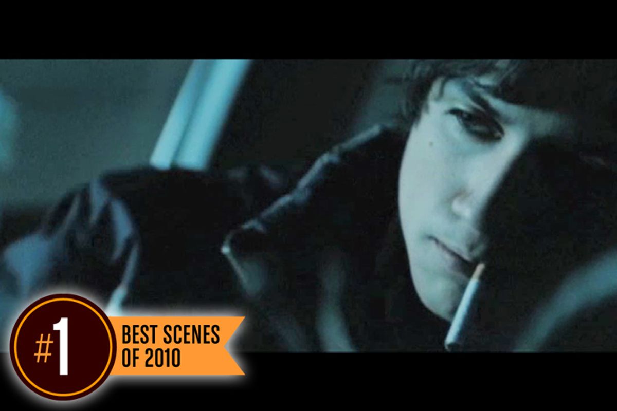
Nowhere is this more apparent than in the aborted kidnapping sequence highlighted here. Shot for shot, beat for beat, it's the scene of the year, laying a foundation of succinct but meaningful shots and then building a madhouse on top of it. The pièce de résistance -- you'll know it when you see it -- is one of the great recent examples of show-off filmmaking in service of story. The universe has been turned upside-down.


Shares