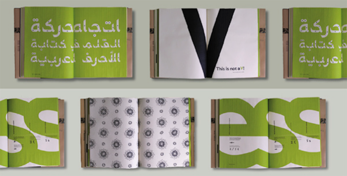
 As a student at Central Saint Martins in London, Rana Abou Rjeily devised the font family Mirsaal, which comprises Arabic and Latin alphabets that work together in typographic harmony. Growing up in Lebanon speaking Arabic, French and English, she found Arabic, her first language, the hardest of the three to learn. In her design classes in London, her classmates were drawn to the calligraphic aesthetics of written Arabic, but they were not able to read the script; they just admired the forms.
Abou Rjeily decided to continue the established tradition of "simplifying" Arabic in order to make it more accessible to nonnative speakers. Back in 1947, the Lebanese architect and typographer Nasri Khattar created Unified Arabic, a 32-character detached alphabet that, according to Abou Rjeily, "was meant to ease the learning and writing of the scripts by reducing the number of shapes letters could assume."
In the 1990s, Mourad Boutros (a leader in the field of Arabic typography since the 1960s, and someone else I have worked with on two books) designed Basic Arabic, "a compromise between Khattar's radical proposal to abandon cursive script and the idea of designing a typographic script with only one shape per letter that would not be joined together when printed."

In Cultural Connectives, Abou Rjeily presents Mirsaal, a contemporary take on Khattar and Boutros' creation of detached Arabic scripts for the benefit of learning and being able to achieve typographic balance between the two alphabets. Relying on the fundamental aspects of both the Arabic and Latin alphabets, Abou Rjeily showcases the versatility of Mirsaal by making clear how different the two alphabets are and how she has fused elements of both to design two attractive and incredibly useful fonts.

Abou Rjeily found her way to me by virtue of the work I've done with Boutros. As an editor, I'm drawn to these sorts of projects because they acknowledge how globalized our lives really are. The world sees the rest of the world's languages on websites, news broadcasts and in print media. While I don't see much of this going on in America, in Europe, Asia and the Middle East, finessing various alphabets into multilingual designs is an increasingly significant facet of graphic design that is well worth paying attention to.
Copyright F+W Media Inc. 2011.
Salon is proud to feature content from Imprint, the fastest-growing design community on the Web. Brought to you by Print magazine, America's oldest and most trusted design voice, Imprint features some of the biggest names in the industry covering visual culture from every angle. Imprint advances and expands the design conversation, providing fresh daily content to the community (and now to Salon.com!), sparking conversation, competition, criticism and passion among its members.


Shares