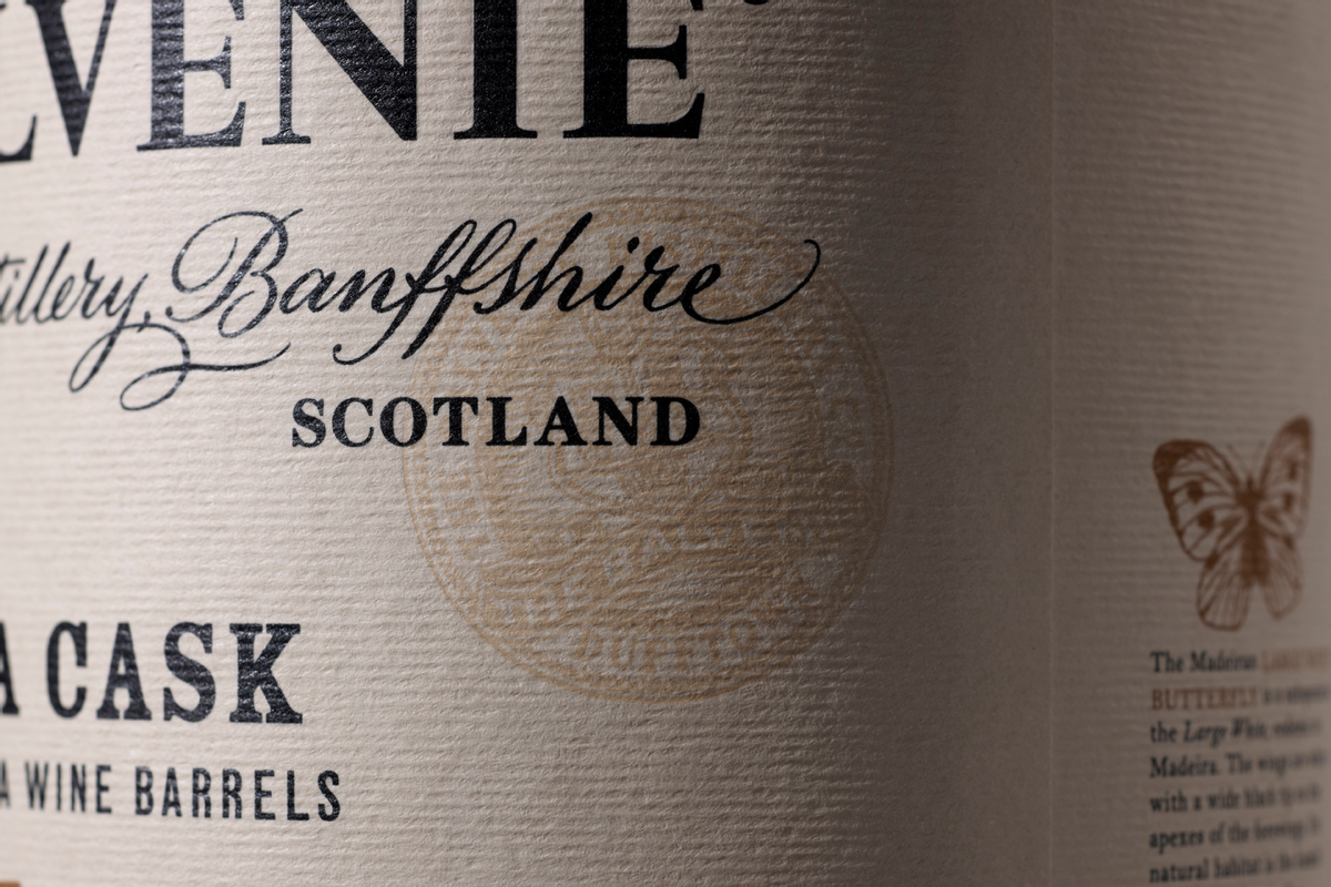
 "Widows and orphans give us sleepless nights." In any other sense, that phrase might conjure up images of black spiders or a certain little redhead named Annie. But when you realize the words were spoken by partner and typographer-extraordinaire Caz Hildebrand of London-based graphic design firm Here Design, the picture changes mighty fast. She adds, "All of us in the Here studio are unhealthily obsessed with the finer aspects of typesetting." And man -- does it show.
Image courtesy Here Design
Image courtesy Here Design
Image courtesy Here Design
Their attention to typography is spot-on awesome. I was first introduced to Here Design's work when I was in a Barnes and Noble last fall and couldn't take my eyes off the book "The Geometry of Pasta." Then writer Ellen Shapiro interviewed Hildebrand about designing the gorgeous cookbook and I was irreversibly hooked on the studio's work. (By the way, if you haven't seen the typolicious teaser animation for "The Geometry of Pasta" where the letters in "Parmesan" literally break off like grated cheese, check it out asap).
But beyond designing cookbooks, Here Design's work is an orgasmic feast for the obsessive-compulsive type geek in all of us. I was hungry to learn more about their type fetish, so we got to talking. The studio was set up in December 2005 in East London by multi-disciplinary designers Kate Marlow, Caz Hildebrand and Mark Paton. Since then, Here Design has been "crafting quietly powerful design" from restaurant branding to cucumber crate packaging (yes, you read that right!) and everything in between.
Image courtesy Here Design
How have you honed your typography over the years?
As a studio, we began five years ago and at that point the three partners of the company had been working in the design industry for many years. Caz, who previously worked at Penguin Books, had the job of structuring, organizing, and simplifying the type styles for all the Penguin Classic texts (of which there were over 1,300 all typeset independently of the others). Following in the footsteps of Jan Tschichold and Hans Schmoller was a fantastic discipline and great opportunity to look closely at the work of these great masters.
Do you have any advice for designers to help improve their type skills?
Further to the previous question and answer: Practice. Likewise, if you haven't used hot metal, go and find a printer who is still setting type by hand. Have a go and it will make much more sense of how letterforms sit next to each other.
Favorite go-to typefaces?
Favorites come and go, but there's always some good old trusty and reliable ones we can fall back on. Baskerville is a classic that we use for our own communications and we prefer the Monotype cutting. Futura is perhaps a more modern classic we use extensively. It has a great variety of weights, and provides typographic 'colour' or distinctive tonal variation on the page. Currently, we seem to be using Neutraface quite a bit. 
Image courtesy Here Design
Image courtesy Here Design
Image courtesy Here Design
What do you love about typography?
Typography is endlessly fascinating. It's inescapable. It is the ultimate form of communication, whatever the medium. As designers, the fact that we have the opportunity to make better the typography we experience every day is pretty great. Check out more fonterrific work from HERE Design.
Copyright F+W Media Inc. 2011.
Salon is proud to feature content from Imprint, the fastest-growing design community on the web. Brought to you by Print magazine, America's oldest and most trusted design voice, Imprint features some of the biggest names in the industry covering visual culture from every angle. Imprint advances and expands the design conversation, providing fresh daily content to the community (and now to salon.com!), sparking conversation, competition, criticism, and passion among its members.


Shares