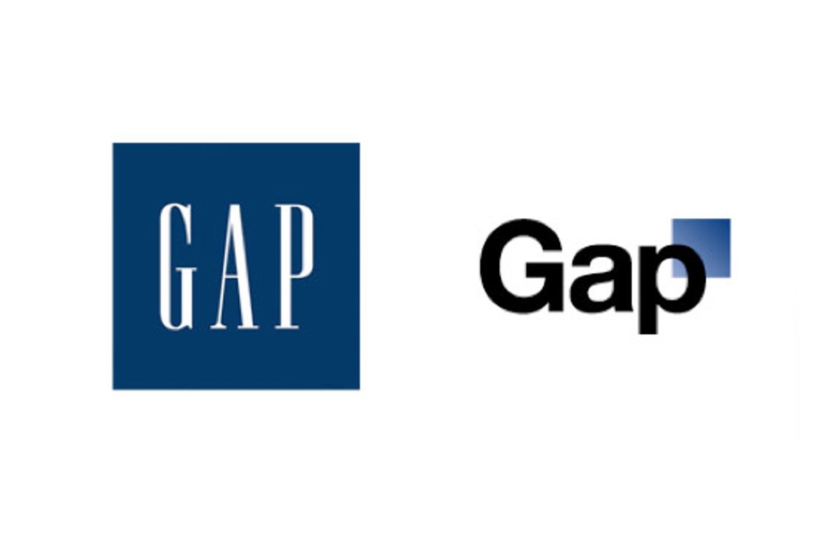
Avert your eyes, graphic designers! The logo you see before you probably violates everything you ever learned in art school. The random blue square, the use of a pedestrian font like Helvetica ... what were they thinking? Brand New thinks it looks like it was done on Microsoft Word, and Fast Company has one word for Gap's new identity.
One might ask why Gap, after 20 years, decided to change what was already an iconic, successful logo? Perhaps it was brand presence. Gap's peak popularity was in the late '90s and early '00s -- a decade ago. How does one stay relevant with the fickle teenage preppy market in a slow economy? Shirtless men don't seem to be working, and neither have sexual harassment lawsuits. So Gap tries ... Helvetica. And a small blue square, because they're "outside the box" (rim shot).
The negative reaction has been so strong, Gap has turned to its Facebook fans to submit user designs, without ever quite coming out and saying the logo was a bad idea. The logo even has its own snarky Twitter account, which is either clever or really, really sad. Fast Company's Co.Design logo inexplicably has an exclusive interview with it.
On the flip side, the Bay Citizen questions whether Gap made its new logo bad on purpose, as a way to attract buzz. Would a corporate behemoth really be that daring? Gap might. Here's a reminder from 1998 of when taking risks worked really well. Who would have thought that the way to make khaki pants cool for teenagers was a commercial of people swing dancing?


Shares