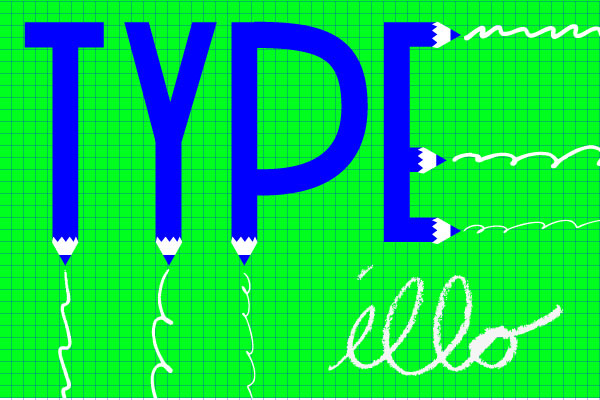
 My colleague and I have been batting this question around ever since we created what we thought was a simple assignment for our Typography students. It reads: Replace all photos on the front page of the newspaper with typographic illustrations.
The point of this assignment is to dive into the world of editorial illustrations, while keeping the focus on typographic solutions. This is familiar to me as most of my design years were spent working for Stephen Doyle, recent recipient of the National Design Award for communication, and a master of (among other things) what I've always referred to as the "typographic illustration."
But that term has started to really bother me.
Perhaps it's the strangeness of the word "illustration." At a recent AIGA Fresh Dialogue, speakers Keetra Dixon, Mike Perry, Andrio Abero, Timothy Goodman all discussed what they "like to introduce themselves as." Graphic designer, designer, maker, artist? The only label that they all had a laugh about was "illustrator." None dared to be labeled such a thing, with no clear explanation.
But perhaps, also, it's the definition of the word "typography," which in a world flooded with information, takes on a much more practical tone. Peter Bil'ak has a few definitions but most tend to specify prefabricated letters and the composition of someone else's words.
The range of things that can be called "illustration" or "typography" is what might be affecting the difficulty in explaining the term to students. The typographic illustrations we intended the students to create could be of any medium and, most important, must have an idea. The student was instructed not to decorate but to illuminate. And even, if necessary, to express their opinion on the subject matter.
If anything, the only way to convey this was through examples. From Chermayoff to Lubalin to Sahre and Victore, the examples spoke louder than explanation, and our assignment was met with incredibly talented work.
Still, I wonder if you have an opinion? Do we need a new term for this type of work? Is it art? Is it typography? Has Mr. Heller written a book on it yet?
Herb Lubalin did it with logos:
Robert Brownjohn took a refined approach:
Stephen Doyle takes a photographic approach to explore materials and sculpture:
James Victore's Racism poster is in the Museum of Modern Art:
Paul Sahre will not stop making you think, then laugh, then think some more:
Michael Bierut uses letterforms to twist a message:
Alan Dye and Internet vulgarity:
Drew Heffron tackles binge drinking:
Joon Mo Kang and the chemistry of sex:
F ogelson-lubliner draw a connection between U.S. wars:
Rodrigo Corral discusses how confusing healthcare is:
Oliver Munday explores equality in American universities:
Salon is proud to feature content from Imprint, the fastest-growing design community on the Web. Brought to you by Print magazine, America's oldest and most trusted design voice, Imprint features some of the biggest names in the industry covering visual culture from every angle. Imprint advances and expands the design conversation, providing fresh daily content to the community (and now to Salon.com!), sparking conversation, competition, criticism and passion among its members.


Shares