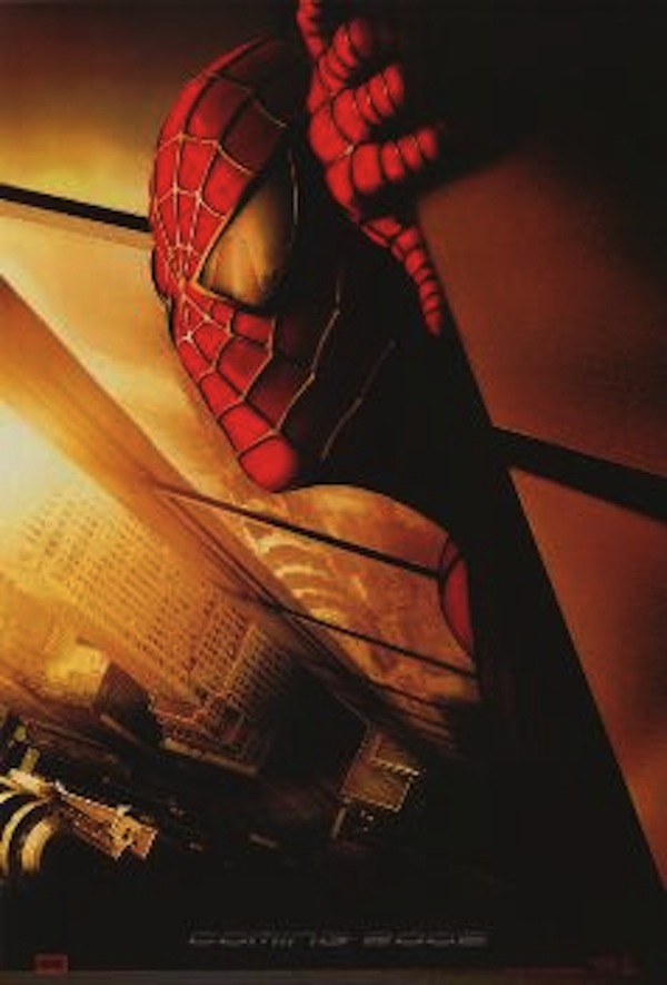
Ten years ago, the first trailer for the hotly anticipated comic-book film “Spider-Man” premiered in theaters. Even though it would be an entire year before Sam Raimi’s adaptation would hit the big screen, you have to remember that back then, big-budget superhero movies weren’t the summer tent poles they are now. “Superman” was still a trilogy from the ’70s, “Batman” was a troubled Joel Schumacher franchise and Tony Stark barely blipped on anyone’s radar. With all the new CGI technology and Raimi’s patented directorial style (“Army of Darkness”!), getting ready for “Spider-Man” 12 months before audiences could see it didn’t seem like a tease; it seemed like a glimpse of the future. Especially since the first trailer featured one of the most iconic uses of the New York architecture in recent cinema history.
According to Sony Pictures, the scene from the trailer was never supposed to be in the film: It was a stand-alone story that was meant to drum up excitement for the film. Which makes sense, given that the trailer didn’t really fit into the logic of the film: How was Spider-Man ever going to build a web that large? Peter Parker isn’t a giant. And he uses his web-slingers to fly from building to building, not catch helicopters. But the trailer managed to invoke a powerful feeling with that image of the bad guys, suddenly so small and caught in between the twin towers in a gigantic death trap. The trailer was considered one of the most successful pieces of visual marketing since “Terminator 2.”
Four months later, Sony was scrambling to yank the trailer out of every theater, along with the original Spider-Man teaser poster that featured the towers reflected in Spidey’s eyes. They weren’t the only ones: After the attacks on the World Trade Center, soon-to-be-released movies that had been shot in New York before 9/11 underwent a crisis: Should they cut out scenes where you could see the towers, as they did with “Men in Black II and the opening to “Law and Order: Criminal Intent“? Should they digitally erase the World Trade Center’s existence with CGI technology as in “Zoolander”? Or should they simply try to work around the footage and attempt to downplay the buildings through editing, like in the romantic comedies “Kissing Jessica Stein” and “Sidewalks of New York”?
As it turned out, many audiences cheered when they saw the towers; it was a reminder that history couldn’t be neatly wiped off the screen. And a more recent parallel popped up after Hurricane Katrina, when the Kate Hudson horror film “Skeleton Key” was released. Though the film was universally panned, the images of an intact New Orleans, maybe the last to be caught in a Hollywood film, gave the film an emotional weight that certainly wasn’t in the script.
Looking back, erasing the Trade Center from the skyline may seem both excessive and over-cautious, but Sony’s heart was in the right place. It’s not that hard to remember how scary and uncertain that period of time was, when destroying all the evidence of the nightmare seemed like a safer idea than showing people what they had just lost.


