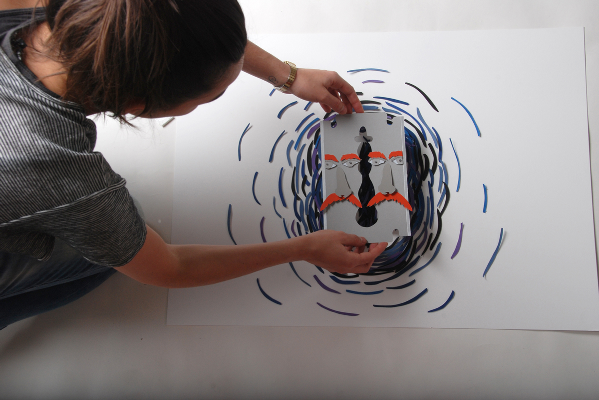
 Alfalfa Studio could not have been cast more perfectly as the design studio of choice for innovative Texas-based theater company Amphibian Stage Productions. Bringing the awesome three-dimensional quality of live theater to the flat, two-dimensional space of poster design is no easy feat. But when you combine the über-creative design skills of the New York-based design firm with the equally risk-taking Forth Worth theater company, the results are paper theatrics at its best.
Image courtesy of Alfalfa Studio
In fact, the two have been collaborating since 2004, with Alfalfa Studio having created more than 40 posters for Amphibian's theatrical works. The outcome of which is mind-blowingly inspired, fresh, original designs that fully capture the essence of their plays -- be it comedy, drama or tragedy. Pushing the creative boundaries even further with this year's 12th season, the Alfalfa Studio team (Minal Nairi, Aldis Ozolins, Patricia Arzimanoglu), under the creative direction of founder Rafael Esquer, has created visuals that are quite literally -- a cut above the rest.
Image courtesy of Alfalfa Studio
Image courtesy of Alfalfa Studio
Armed with scissors, cardboard, glue, threads and other craft materials, the designers set about bringing the stage works to life through paper. Esquer explains, "The same desire to further Amphibian's mission in producing 'innovative and engaging works of theatre' drove us to the creation of visuals out of paper ... We created images that have dimensionality and appeal to the senses, inviting viewers to 'feel' the themes and conflicts in the play."
Image courtesy of Alfalfa Studio
The process of creating the designs (although complex and intricate) sounds like it was as fun to make, as it is to ogle over the final wow-worthy visuals. After reading all six of Amphibian's new plays and discussing/brainstorming ideas like, "Why was this play written? What does the playwright want to say? What image will be the most seductive or intriguing?," the design team sketched a myriad of ideas. The selected drawings for each poster were then re-created into three-dimensional form using precisely cut paper, intricate folding, detailed painting techniques and more.
Image courtesy of Alfalfa Studio
Esquer adds, "The richness of color comes from the free paint swatches that we 'collected' in many trips to Home Depot's paint department. We also visited the art store to get additional color paper in as many textures and styles as possible."
Image courtesy of Alfalfa Studio
Image courtesy of Alfalfa Studio
Finally, Alfalfa Studio photographed the three-dimensional compositions in the studio, playing with various lighting techniques until they achieved the desired depth and shadows.
Image courtesy of Alfalfa Studio
Image courtesy of Alfalfa Studio
And from the looks of it, you can totally see why their posters have become smash-hit collectors items with the Forth Worth theater-going audience.
Image courtesy of Alfalfa Studio
Image courtesy of Alfalfa Studio
"We love experimentation," Esquer says, "Designing for theatre encourages this attitude." For a more in-depth behind-the-scenes making of the posters check out this video. To see more of Alfalfa Studio's super fun, inventive designs visit its website.


Shares