 Fine artists look down on graphic designers. And graphic designers look down on comics artists.
Like all generalizations, this one isn't entirely true. For one thing, a great number of successful designers look into the work of comics artists, very often and very closely.
Chip Kidd is, of course, the prime example. He was also the obvious choice to moderate a discussion about the art of design, and how it relates to comics, at the recent San Diego Comic-Con. Panelists included Seymour Chwast, Craig Yoe, Michael Gross, and Mark Chiarello. You can find a thorough report on the session at Comic Book Resources.
Afterward, I asked these super-pros about design projects that were directly inspired by the comics medium. And here are their answers.
.


Frank Miller: The Dark Knight Returns, The Dark Knight Strikes Again x 2, Sin City.
Several years ago, it was my daunting privilege to redesign one of the most iconic comic book covers of all time, for a new reissue of "The Dark Knight Returns," and then its sequel "The Dark Knight Strikes Again." Sometimes as a designer, being a huge fan of what you're working on can actually be a disadvantage because you feel anything you do will be unworthy. But Frank Miller was totally supportive on both of these, especially the sequel cover, which was literally over the top.
Definitely one of my proudest moments as a comics designer and fan.
.


Captain America x 4: 1941 - 1944
This spread is from the "Tricks" issue of my publication, the Nose. It illustrates the war-mongering news story about the sinking of the USS Maine in Spanish Cuba.
I was inspired by some of the same explosive lettering that Roy Lichtenstein used. Except mine came from the "Captain America" comics of the 1940s.
.


Wally Wood, Joe Kubert, Walter Lantz Studio, Simon/Kirby Studio.
One of my new books, "Amazing 3-D Comics," has its cover inspired by an old comic book convention. Comic books at one time were wonderfully thick 52-page anthologies featuring a zoo full of 'toons. So a title like "New Funnies" might have Woody Woodpecker large as the main feature but Andy Panda, Oswald the Lucky Rabbit, Charlie Chicken and Homer Penguin running up the side, to give you a taste of all the features inside.
There was a practical design aspect to this approach. There were hundreds of comic books on the racks in candy stores and newsstands. Retailers would cram the cornucopia of books together, overlapping the covers. Only the left hand side would show. That's also why the publishers' logos were always on the left.
So "Amazing 3-D" sports a 12-layer lenticular drawing by the inventor of 3-D comics, Joe Kubert. Joe created this especially for our six-color -- plus spot varnish -- cover. On the left band is a jungle girl, Felix, and a brand-new superhero, Yoe-man. These figures represent the sort of genres you can find inside the book.
.


Wally Wood, Frank Frazetta x 3.
I was first introduced to comic art through Mad magazine in the comics years. Wally Wood "did it" for me! I explored further in my teens and discovered Frank Frazetta. This led to my very real interest in great comic art.
When I became art director of National Lampoon one of my first assignments was to hire Frank for the "Adventure" issue. It was the first of three covers he did. I like to think I also exposed his work to a new audience.
An exchange of talents -- and a great friendship -- continued between us for years.
.


Ludwig Hohlwein, Daniel Torres, Alex Toth, Darwyn Cooke.
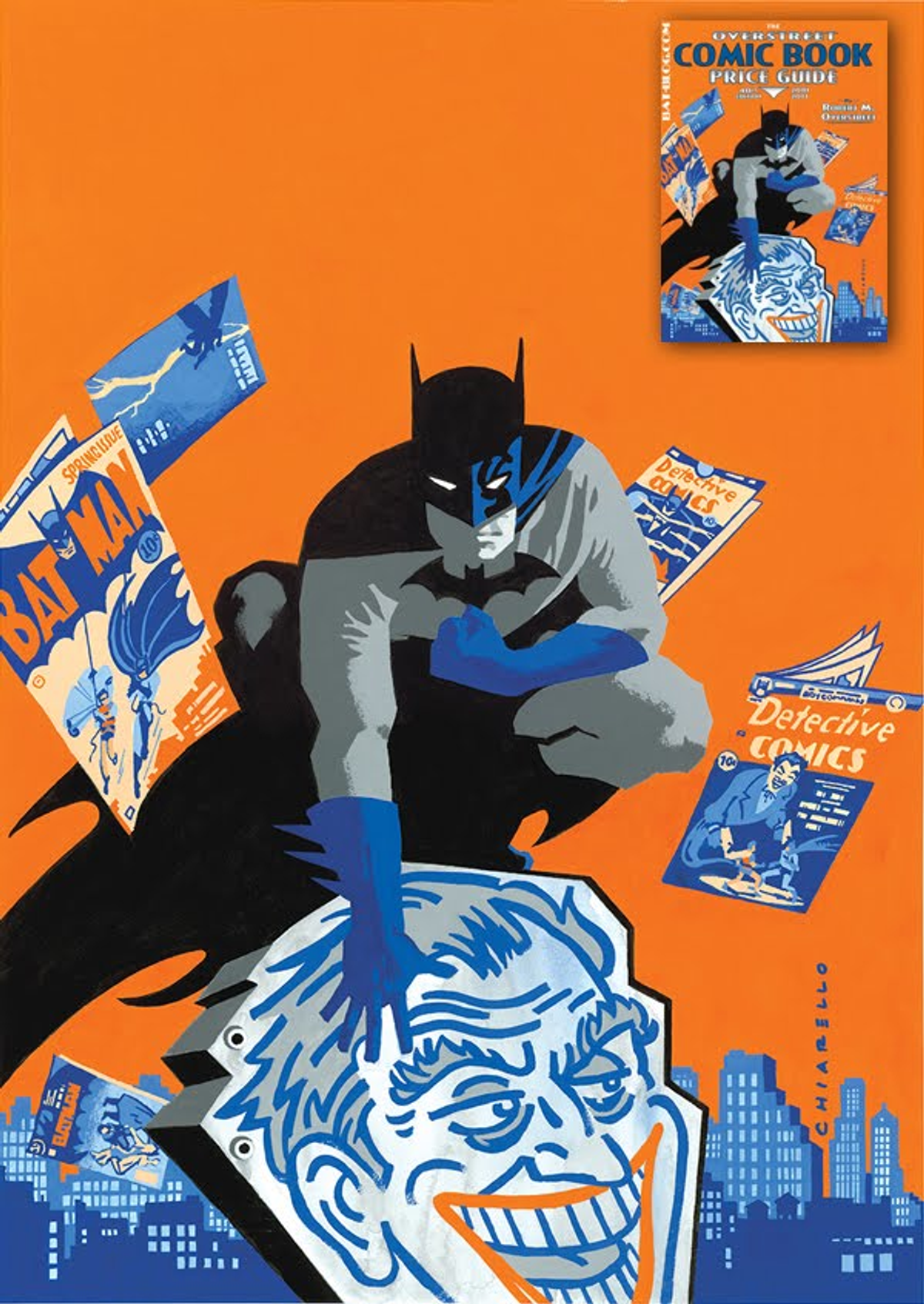
I'm never quite sure if I'm a graphic designer who illustrates or an illustrator who does graphic design. I guess that's not for me to say.
My cover art to the 2011 Comic Book Price Guide clearly shows my leanings toward the "design-y" and away from the illustrative. My influences are also pretty clear: Alex Toth, Daniel Torres, Ludwig Hohlwein, and Stan Galli. All heroes of mine.
I try to keep my colors immediate, powerful and poster-like. The most fun part is losing edges, a practice referred to as "implied line," and one done with great sophistication and success by comics artists Michael Cho, Darwyn Cooke and the master of us all, the aforementioned Alex Toth.
.

Chip Kidd, Mark Chiarello, Seymour Chwast, Craig Yoe, Michael Gross. Photo by M. Dooley
Copyright F+W Media Inc. 2011.
Salon is proud to feature content from Imprint, the fastest-growing design community on the web. Brought to you by Print magazine, America's oldest and most trusted design voice, Imprint features some of the biggest names in the industry covering visual culture from every angle. Imprint advances and expands the design conversation, providing fresh daily content to the community (and now to salon.com!), sparking conversation, competition, criticism, and passion among its members.


Shares