 If you ask any graphic design student at San Francisco's Academy of Art University to name his or her most-faved teachers, Typography 2 instructor Carolina de Bartolo will no doubt pop up in the mix. In fact, it was her students' encouragement (and their resulting wow-worthy portfolios) that finally convinced de Bartolo to bring her 10-years-in-the-making book idea to fruition. Two more years and a steep learning curve later, de Bartolo can now add author/entrepreneur to her title. "Explorations in Typography: Mastering the Art of Fine Typesetting" is de Bartolo's first venture into the world of self-publishing -- and a beautiful, instructive piece to boot.
"Explorations in Typography" by Carolina de Bartolo
"Explorations in Typography" by Carolina de Bartolo
"Explorations in Typography" by Carolina de Bartolo
"Writing and designing were the easy parts," explains this Carnegie Mellon grad. "The problem was that, while I'd designed books for other publishers, I had almost no idea how to publish it myself!" she admits.
So why go it on her own? "Publishers are not designers, they're business people. So, they tend to 'play it safe' and republish the same kinds of graphic design books over and over -- the ones that have already been proven to sell," de Bartolo explains. With "Explorations in Typography" geared more toward intermediate-level designers (a virtually untapped market), the book was a hard sell for publishing folks -- even with type superstar Erik Spiekermann's name on the proposal too.
So after running the numbers this letter-loving learner decided to DIY-it and "did the research, asked the questions, and figured it out as I went along." From finding a reliable and cost-efficient printer in China, to hauling it across the globe for press checks, to marketing, distribution and establishing her own publishing company, de Bartolo worked through the kinks and unknowns. Upon holding the first copies in her hands, she was beyond excited to have it all done. But she adds, "I'd designed enough books to know that no book has zero mistakes. So, you just hope that they're minor and don't pop forward or detract from the overall effect. And you fix them on reprints!"
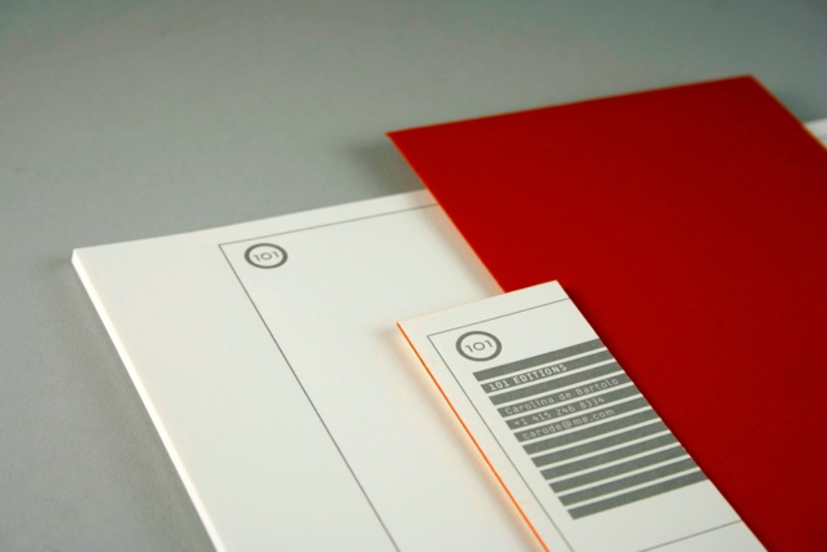
But, honestly, you'd be hard-pressed to find even a hairline rule out of place in "Explorations in Typography." With every design detail given the utmost of consideration, this hard and fast typesetting rule book is both a must-read visual learner for young designers and a solid reference for design pros. While I could geek out over de Bartolo's concise how-to's on ragging centered text or setting the perfect drop cap (illustrated through Spiekermann's repeated text), I'm just as excited about the letterpress stationery she designed for her publishing biz (below). 
Stationery created for 101 Editions, Carolina de Bartolo's new publishing company
Stationery created for 101 Editions, Carolina de Bartolo's new publishing company
But the question remains: Would she do it all over again? "Most definitely! I have another graphic design book in the works that I plan to self-publish too -- this time on grids for page layout." Awesome. In the meantime, snag yourself a copy of "Explorations in Typography" on de Bartolo's super-cool site.
Copyright F+W Media Inc. 2011.
Salon is proud to feature content from Imprint, the fastest-growing design community on the web. Brought to you by Print magazine, America's oldest and most trusted design voice, Imprint features some of the biggest names in the industry covering visual culture from every angle. Imprint advances and expands the design conversation, providing fresh daily content to the community (and now to salon.com!), sparking conversation, competition, criticism, and passion among its members.


Shares