 In the spring of 1992 I was contacted by and collaborated with Betty Cohen, Tom Corey and Tom Pomposello on an in-house sales film that was to help define what Turner Broadcasting had in mind for its newly acquired library of Hanna-Barbera cartoons. I was informed that the Atlanta-based network would launch a 24-hour “Cartoon Network." The thought was mind-blowing! Betty and both Toms were veterans of MTV Networks, specifically Nickelodeon, and were bringing their sharp marketing sensibilities to Ted Turner’s world.
Now, I’d always been a reluctant follower of Hanna-Barbera’s post-1960 TV cartoon roster, but I’d always acknowledged how the potent narcotic of nostalgia could jostle my level of taste. It’s this basic phenomenon that Betty and her crew would tap into. MTV/Nickelodeon were geniuses at branding and marketing. Look at what they did with all the MTV network IDs, which not only stamped their logo into the viewers’ brains, but reinforced the network’s sensibility by utilizing endless animated techniques and styles. The creation of their Nick@Nite evening block allowed them to take advantage of the availability of “useless” 1950s TV reruns by repackaging them as self-parodies. All this back story helps put into perspective how CN formed, and to share an example of one of their promotional giveaways – a favorite of mine!
I’d get yearly mailings from Cartoon Network and they were always smart, fun and clever, but the unsolicited package I received in 1997 was a little bigger this time. I opened it up and inside was a 5-inch-by-9-inch box with a lid consisting of a collage of Hanna-Barbera cartoon characters done in graphic styles that I’d never seen HB characters done in! On the top edge was printed:
Uh, OK ... this better be good ... It was.
You open the hinged box and a stack of cards wrapped with a sheer checkerboard (part of the CN logo) sleeve present themselves:
This “portfolio” of the network’s stable of characters begins with a mini poster by Jessie Hartland. . .
... an intro card ...
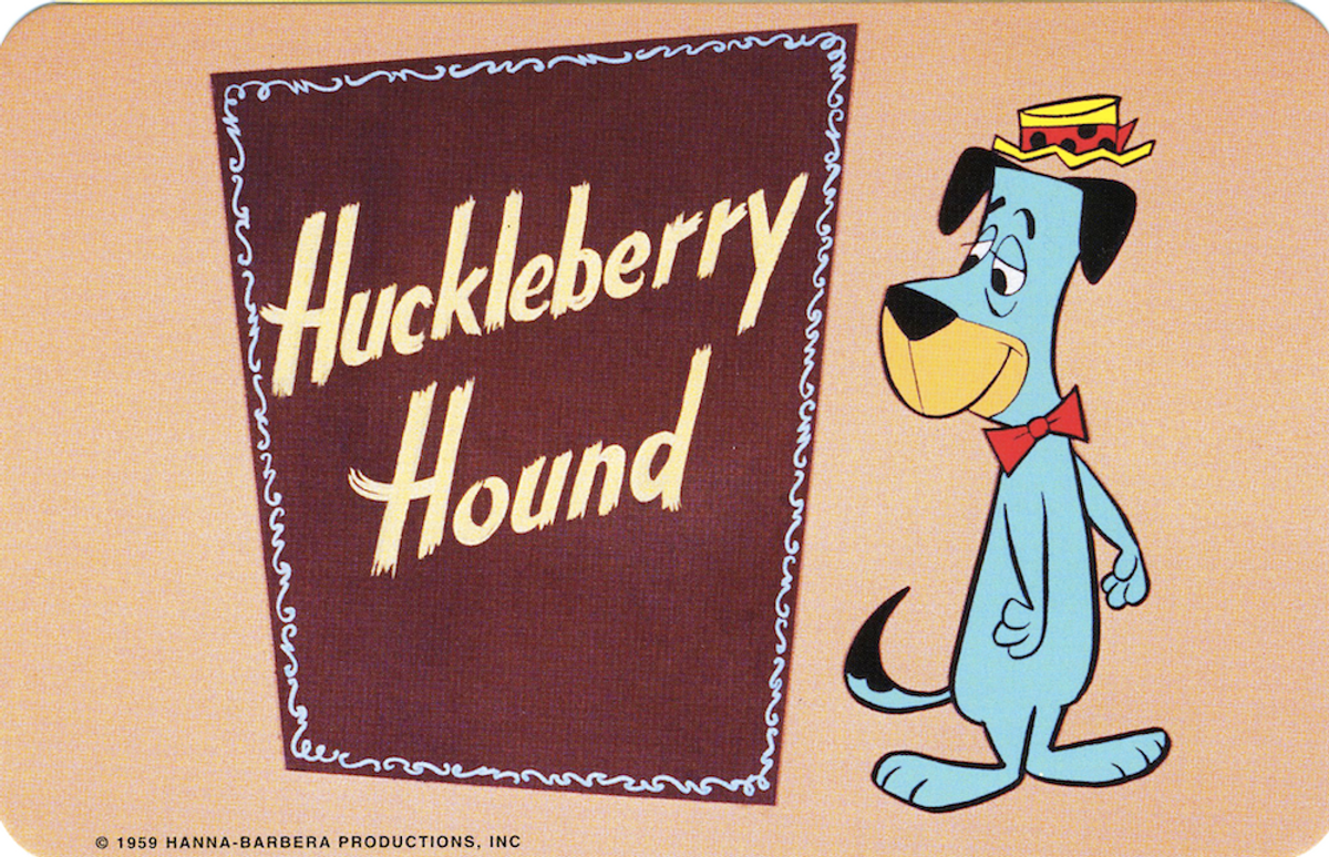
And then proceeds to guide you through a graphic journey starting with vintage opening title cards ...
... to independent artist/illustrator/designer renditions ...
[caption id="attachment_227421" align="aligncenter" width="445" caption="(David Goldin's Atom Ant on the left)"] [/caption]
[caption id="attachment_227424" align="aligncenter" width="445" caption="(J. Otto Siebold on the right)"] [/caption]
[caption id="attachment_227425" align="aligncenter" width="445" caption="(Philip Burke on the left)"] [/caption]
[caption id="attachment_227426" align="aligncenter" width="445" caption="(Left: Lou Brooks / Right: Gary Baseman)"] [/caption]
And finally (the weakest of the bunch) stylized photographics:
This tasty promotional gift is a trifecta and does everything it sets out to do. It appeals to the people who grew up with these cartoon “friends” and gives a pleasant little tug to their heartstrings (and dispenses a dose from the “nostalgia drip” we all have permanently inserted in our vein), it shows how cool they are, with the likes of Gary Baseman, Philip Burke, David Goldin, Lou Brooks, J. Otto Siebold, John K., etc., contributing their art, and they demonstrate (again, the weakest of the three) how the these brands are viable graphic icons that can apply to everything from baseball caps to T-shirts.
Axiom LA & SLC is responsible for the design and production.
This may not seem like a big deal today, but this 1992-2001 period (culminating with the launch of its groundbreaking “Adult Swim” block) was instrumental in establishing CN as a powerhouse in cable programming. It also effectively won over the position that Nickelodeon/Nicktoons had created and held prior. But that’s not a big surprise when you realize how many people eventually left Nick for Atlanta. Linda Simensky, a key programming exec, also joined CN from Nick in 1995. Another interesting approach that CN took (especially when it came to "Adult Swim") that seems to have had a direct effect on its rise was the hiring of advertising agency copywriters on staff to write, create and strategize. For example, we did several animated campaigns for Old Navy in 1999-2000 that inspired CN to call and ask who wrote the spots – the writer was hired by CN soon thereafter.
I’d like to dedicate this piece to the two Toms: Tom Pomposello and Tom Corey. Both were important talents in the Nick and CN genesis.
“Honest Tom” Pomposello was responsible for my entry into the cable world and we did a crazy amount of work together before he passed away in 1999. I miss him terribly.
Tom Corey was a brilliant designer (he designed the logos for Nickelodeon, Nick@Nite, CN, to name a few) and friend from the time we worked together on the CN launch; he also passed away much too young in 1999. Corey McPhearson Nash as well as Big Blue Dot, both out of the Boston area, continue to carry his torch.
Thanks to Corrie Lebens for her assistance!
Copyright F+W Media Inc. 2011.
Salon is proud to feature content from Imprint, the fastest-growing design community on the web. Brought to you by Print magazine, America's oldest and most trusted design voice, Imprint features some of the biggest names in the industry covering visual culture from every angle. Imprint advances and expands the design conversation, providing fresh daily content to the community (and now to salon.com!), sparking conversation, competition, criticism, and passion among its members.


Shares