 I hear you. My teenage years ended abruptly at the turn of the century. This means I was born the year MTV went on the air and my entire teenage years were spent in the 1990s.
It's no wonder that upon leaving college as an official graphic designer, I was at odds with the decades I was reared in. I hated all of the styles I'd known. I hated the '80s. I hated Memphis. I hated April Greiman posters. I hated Neville Brody. I hated the '90s. I hated Raygun. I hated Emigre.
Styles always return. It's a boring subject but it's true. Just check out Rookie Mag and watch today's teenagers fall in love with Blossom. Or see Beavis and Butt-Head returning to MTV. Or, like me, after seven years of not owning a TV, watch "Seinfeld" again. It is amazing and it is really, really ancient.
A resurgence is always hardest for the people who were young during the time the styles were created. I had a rough time with the return of hints of these two decades in design and typography, but I let go of the nostalgia (or I embraced it?) and it feels great.
If you are having a hard time, try now to look into the forms and what they mean. And while I can't put my finger on what makes a lot of today's work feel like those two decades I have decided there are two ideas that feel lifted from the past and returned with an excitement: primitivism and customized type. If you are like me, and you've ignored it all these years, go look at "The Graphic Language of Neville Brody"; it's splendid and the most contemporary-feeling book on my shelf.
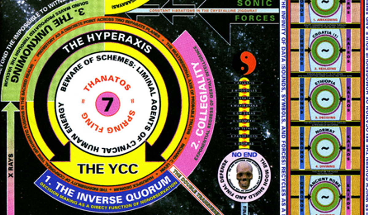
Here are some pieces from the amazing (and contemporary) David Rudnick that made me feel particularly excited about what I thought I used to hate. Turns out it's totally fucking* fun!
* I used to love swear words as a teen
Copyright & Footer:
Copyright F+W Media Inc. 2011.
Salon is proud to feature content from Imprint, the fastest-growing design community on the web. Brought to you by Print magazine, America's oldest and most trusted design voice, Imprint features some of the biggest names in the industry covering visual culture from every angle. Imprint advances and expands the design conversation, providing fresh daily content to the community (and now to salon.com!), sparking conversation, competition, criticism, and passion among its members.


Shares