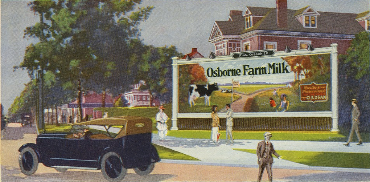
[caption id="attachment_232006" align="aligncenter" width="460" caption=""Outdoor Advertising" by Wilmot Lippincott - 1923"] [/caption]
 While researching an article I’m doing for an upcoming subject on 1920s posters, I pulled several books off my shelf to leaf through hoping to find some supplemental material. One of the volumes I grabbed was “Outdoor Advertising” by Wilmot Lippincott published by the McGraw-Hill Company in 1923. A relatively unassuming looking book from the outside – 8 ¾” X 5 ¾”, 340 pp, no dust jacket, simple binding, almost textbook (which I suppose it was) in appearance. I remember picking it up at a sidewalk book sale years ago, and I also remember how books like these could be had for a song, 20 or 30 years ago. Even Barnes & Noble would sell them for a couple bucks in their basement used-book section. I’d forgotten how tasty this modest little tome was! It traces the history and application of outdoor advertising. Posters, billboards and all the various techniques used in the 1920s are explained and analyzed.
But what I found captivating was the 30-page color section provided in the middle. All the plates are printed on glossy stock and although they all use photographs as source material, they’ve been so heavily retouched and modified to present their case that they’re closer to paintings than documentary snapshots. Some of them feel oddly Edward Hopper-ish.
After perusing this particular tome I decided to reacquaint myself with some of the other similar books in the studio’s library. I pulled a handful of other titles that were equally luscious in their production value and just as bland in their outward appearance. I’ve included some images from them below as well. Enjoy!
[caption id="attachment_231987" align="aligncenter" width="460" caption="From "Advertising Production Methods" by Albert W. Dippy 1929. The top left image is an actual silk screened print bound into the book."] [/caption]
[caption id="attachment_231986" align="aligncenter" width="460" caption="From "The Advertising Handbook" by S. Roland Hall 1930"] [/caption]
[caption id="attachment_231989" align="aligncenter" width="331" caption="From "Light And Color In Advertising And Merchandising" by M. Luckiesh 1923. The second image from the top utilizes actual fabric swatches glued to the page."] [/caption]
[caption id="attachment_231990" align="aligncenter" width="460" caption="From "Time and Motion Study" by Stewart M. Lowry, Harold B. Maynard and G.J. Stegemerten 1940."] [/caption]
[caption id="attachment_231988" align="aligncenter" width="460" caption="From "Illustration In Advertising" by W. Livingston Larned 1925."] [/caption]
Thank you to Corrie Lebens for help preparing this article!
Copyright F+W Media Inc. 2011.
Salon is proud to feature content from Imprint, the fastest-growing design community on the web. Brought to you by Print magazine, America's oldest and most trusted design voice, Imprint features some of the biggest names in the industry covering visual culture from every angle. Imprint advances and expands the design conversation, providing fresh daily content to the community (and now to salon.com!), sparking conversation, competition, criticism, and passion among its members.


Shares