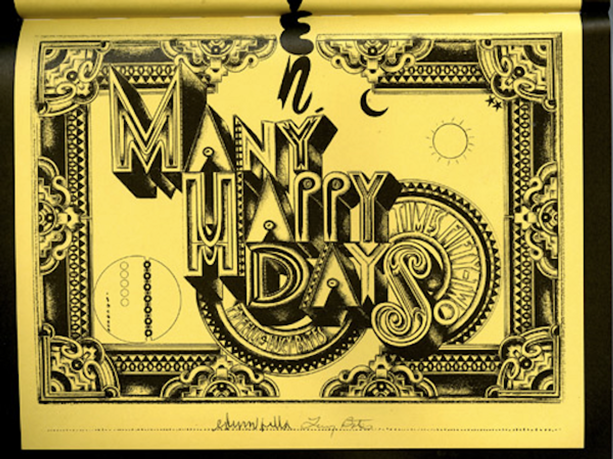
 Even if you've been fortunate enough to receive Ed Fella's annual holiday poster, or the occasional package of his exhibition and lecture posters, this book, "Ed Fella Documents" written by Vincent Tuset-Anres, is a must-have. This is a substantial catalog of the exhibit of the same name held from May 21 to Aug. 26, 2011, in Chaumont, France, as part of the 22nd International Poster and Graphic Design Festival (it later moved to the Laterna Magica Festival in Marseille, where it closed on Dec. 24). I picked mine up at the MoMA/Soho store in New York. It chronicles some of his typographic art projects, and for the Fellaficinado there are very early examples of when he worked for Detroit commercial art bullpens.
For those who do not know Edward Fella: In the 1980s, after a lifetime working as a commercial artist in a Detroit studio primarily servicing the auto industry, Fella enrolled as a graduate student at the Cranbrook Academy of Art in Bloomington, Mich. After graduating with an MFA, he became one of its most popular teachers. Cranbrook took the vanguard of “the new theory,” a blend of deconstructionist literary concepts wed to typographic practice that gave birth to a wave of young designers and design educators. Fella reveled in this hothouse environment. In fact, the risks that he had avoided in his younger days while producing illustrations and brochures for conservative commercial clients seemed to pour out of him after “retiring” to academia. He produced an astonishing array of expressively raw, misshapen, hand-lettered type compositions that were used as posters and invitations for eclectic art galleries and nonprofit cultural institutions in the Detroit area.
The prolific and prodigious Fella arguably revived hand-drawn typography and made it a period style. When Fella started making contorted hand-hewn typography that echoed the earlier “words in freedom” practiced by avant-garde dadaist, futurist, and surrealist designers, he swore never to do a “straight job” again.
What typifies the Fella style is a boundless curiosity and effortless rule busting. The former took him on an odyssey around the United States photographing ad hoc and amateur signs -- ultimately collected in the book "Letters on America" (Princeton Architectural Press, 2000) -- and making signs of his own. The latter gave him license to create his own typographic systems that are part illustration and part scribble.
During the late 1980s and '90s Fella’s free-form, serendipitous approach to typographic design earned him exposure in the pioneering type magazine Emigre, which saw in Fella’s handwork inspiration for new expressive digital compositions. The era of late modernism, with its emphasis on transparency, clarity and the grid, had fallen out of favor. Fella’s work rejected impersonal universality, and his matter-of-fact disregard for the strictures adhered to throughout his professional life appealed to many young designers who saw graphic design as an expressive medium.
Fella made a huge impact with his quirky typeface OutWest, with characters that look like cacti wearing cowboy hats, and his comic dingbats Fella Parts, nonsensical abstract designs -- both distributed through Emigre Fonts. Fella always worked as though the hand is mightier than the pixel; still, each of his fonts was digitized for widespread sale. Although he'd turned his back on the commercial life, these fonts found their way into the design mainstream. For Fella primitivism is an antidote to slick professionalism -- but his approach is neither artless nor naive. Fella knows exactly what he's doing.
(See The Weekend Daily Heller for a new "graphic" novel in the form of a scrapbook.)

Copyright F+W Media Inc. 2011.
Salon is proud to feature content from Imprint, the fastest-growing design community on the web. Brought to you by Print magazine, America's oldest and most trusted design voice, Imprint features some of the biggest names in the industry covering visual culture from every angle. Imprint advances and expands the design conversation, providing fresh daily content to the community (and now to Salon.com!), sparking conversation, competition, criticism, and passion among its members.


Shares