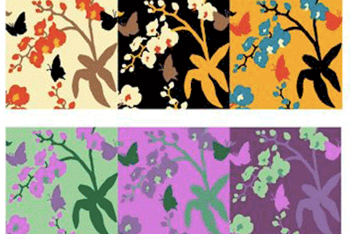
 Welcome back to an ongoing, freewheeling conversation on color with Thomas Bosket and Langdon Graves, who both teach color theory at Parsons the New School for Design. (Read part 1 to catch up.)
Do you have any knockout students in your color theory classes right now?
Thomas Bosket: I haven't taught color this past year, so here are some students from previous years: one work by Liz Marshall exhibited the Bezold effect and the economic use of color. [Ed note: the Bezold effect is an optical illusion in which two colors, juxtaposed in small doses, distort the impression of each color’s shade, just by proximity to another hue.] The other, by Stephanie Luk, offers a redesign of Parsons' very narrow hallways.
 Bezold Effect study by Liz Marshall
 Colour of Space assignment for Parsons’ narrow hallways, by Stephanie Luk
Langdon Graves: I had a terrific class last fall because of how dedicated the students were. Early each semester, I assign a Creative Color Chart -- a spin on the traditional color wheel -- for which the students create their own progressive designs featuring 12 hues, tints and shades. One student, Christine Gurtler, designed a chart inspired by the grid of a bird's-eye view of Manhattan:

That's all acrylic paint and paper. Obviously, she went beyond 12.
Two semesters ago I gave the assignment to design an infographic to represent a personal experience, using color in a significant way. A student named Vaishnavi Mahendran charted the progression of her taste in music and fashion from childhood to adulthood, assigning an increasingly darker, more sophisticated hue of pink to each phase of her life (interrupted by an amusing black/metal phase). It's such a clever and attractive design, I love sharing it:
 Detail from infographic by Vaishnavi Mahendran
Lightning-round: Whom would you rather have as a roomie on a desert island, Josef Albers or Johannes Itten? [Note: both men are Bauhaus artists noted for their contributions to “classic” color theory.]
 From Homage to the Square color-interaction series, by Josef Albers
TB: Itten. He was trying to understand color and contextualize it. Albers feels too esoteric (in an uninteresting and exclusive manner -- we have history, Albers and I ... grad school!) and his work has been turned into "rules," no fault of his, but I could just see hours and hours of argument about the color of the sunsets.
 Horizontal Vertical, by Johannes Itten
LG: I know I should say Itten because he was such a master and without him, we certainly wouldn't have as much to learn from Albers. But I think I would choose Albers because of how much he attributed his appreciation for color to his experiences with his students.
This is how I continue to learn about color, myself: by interacting with other people and learning as much from them as they do from me. I also like the thought of sitting around on a desert island with Albers, creating simultaneous contrast collages of found mango leaves.
Copyright F+W Media Inc. 2012.
Salon is proud to feature content from Imprint, the fastest-growing design community on the web. Brought to you by Print magazine, America's oldest and most trusted design voice, Imprint features some of the biggest names in the industry covering visual culture from every angle. Imprint advances and expands the design conversation, providing fresh daily content to the community (and now to salon.com!), sparking conversation, competition, criticism, and passion among its members.


Shares