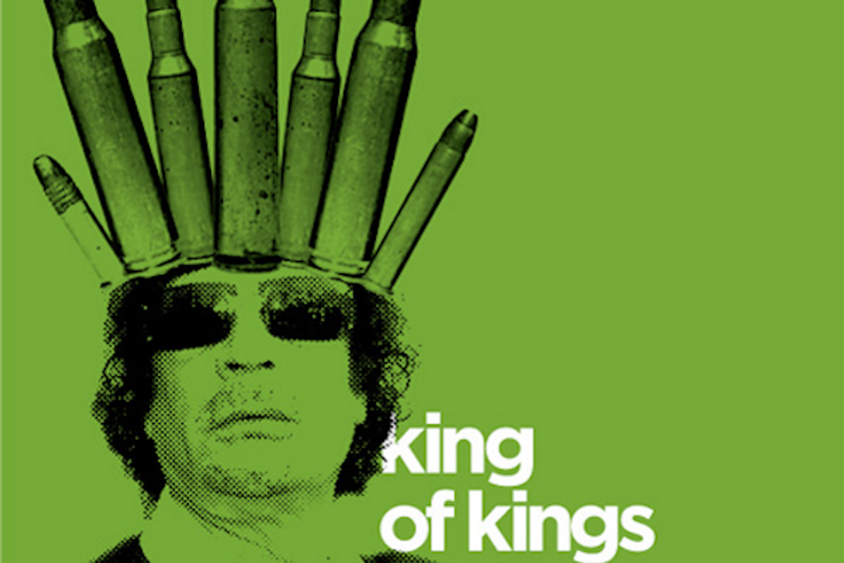
 Ever wonder what a graphic designer does to wile away the idle hours. Johnny Selman spends every morning ritually checking headlines on the BBC. But that’s not all. In 2010, “I decided to create a poster a day for 20 days in reaction to a headline for each day,” he recently told me. This exercise triggered the idea for his Academy of Art University in San Francisco graduate school thesis, which he expanded into 365 days of posters and world news, he calls "BBCx365." It is an obsessive tour de force.
"The purpose of this project is to promote the awareness of global current events with the American public," Selman wrote in the introduction to his website. "'American citizens know little about current events in general and even less about overseas events' according to The Washington Post in 2006."
The changing pool of content kept the project exciting, he says. “I created a tight set of design parameters to ensure that the project would hang together as a set at the end of the day. I reduced the composition to its simplest visual form and removed all unnecessary elements from the designs. The most challenging aspect to the project, outside the 'Groundhog Day'-like repetition, was the importance of creating designs based on rich ideas.”
Slow news days were inevitable, but he tried to instill a sense of urgency and importance to every story he represented in the hopes that someone would be inspired by even the more bland news days. Still, keeping up the pace day after day, approaching every story as new and maintaining a semblance of originality had to be a chore. “I had elements of gestural drawing in my posters,” he explains, “and many times I would reuse bits and pieces of an already used image to provoke a different thought. There were times when using a repetitive image added to the posters' meaning, such as the two posters about the Dutch family that was held captive by pirates in Somalia. The reuse of the imagery helped bring closure to an already told story.”
Rigor is imperative when creating a daily poster. So Selman’s list of dos and don'ts included: “Use as few elements as possible. Reduce the story to its simplest visual form. Don’t over think it. Don’t overwork it. Use as few colors as possible. Use flat color. Use color as a representative element. Don’t use gradients. Use typography as the central visual element whenever possible. Use Gotham Bold or your hand. When needed use Tungsten Bold as a condensed face. Other typefaces can be used sparingly for parody. Use bitmap and vector graphics. Rip the levels out of photographs. Keep it interesting. Use humor. Use parody. Use satire. Use visual puns. Stay neutral. Be bold. Don’t be afraid.”
The task he set for himself was exhausting. Some days he just wanted to sleep in. “In order to maintain sanity within a task like this you have to allow yourself room to breathe and give yourself a break once in a while,” he notes. It was best to start my posters when I was feeling inspired or up to the task, “it made the process go quicker than if I forced myself to to sit and stare at my computer or endlessly sketch in my notebook.”
But the project became “the constant in my life.” Through sickness, vacation, injury, work and even a houseboat bachelor party, the daily design ritual was there like a backbone. “A deadline that was as predictable as the temperature in San Francisco.”
The posters vary in conceptual acuity, but on the whole Selman's visual shorthand is up to the task. There are also traces of various other poster designers, including Paul Rand, Joseph Müller-Brockmann, Armin Hofmann, Ivan Chermayeff, even James Victore, and others who view economy as a virtue.
Selman insists the poster marathon had an ultimate purpose. To take complex information and to distill it down into digestible bites. “I certainly learned about time management,” he adds. “I learned how to deal with the barrage of anonymous online criticism [the series had an online component that drew many yays and nays].”
In the final analysis, Selman, who graduated in December 2011, admits, “The skill-set I gained during the course of the project can be directly applied to many aspects of visual communication. I’m working in New York now and am involved in some really exciting projects. Most of all, I’m making up for lost time with my wife. We are quickly referring to events in our lives as pre- or post-posters.”
Copyright F+W Media Inc. 2012.
Salon is proud to feature content from Imprint, the fastest-growing design community on the web. Brought to you by Print magazine, America's oldest and most trusted design voice, Imprint features some of the biggest names in the industry covering visual culture from every angle. Imprint advances and expands the design conversation, providing fresh daily content to the community (and now to salon.com!), sparking conversation, competition, criticism, and passion among its members.


Shares