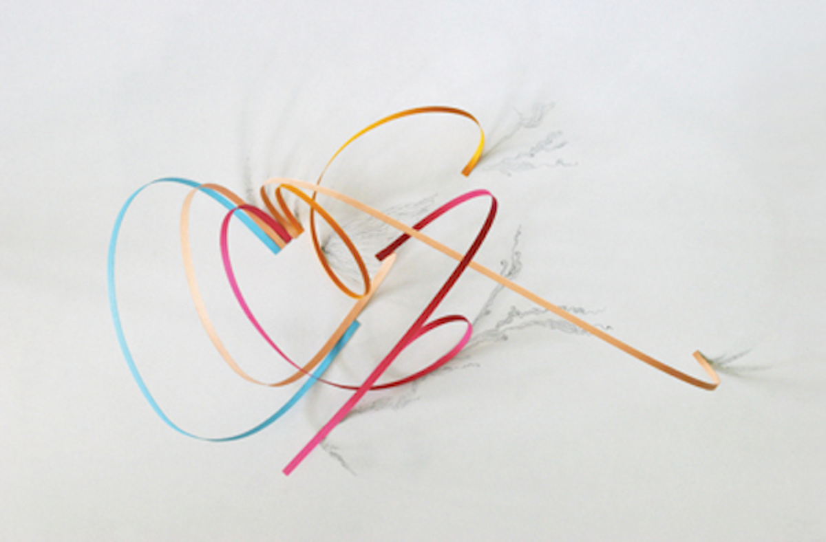
 Looking at Jerome Corgier’s type sculptures, with their suggestive, amorphous shapes, can be a bit like gazing at clouds. In his love for pure typography, Corgier often strips down forms until their meaning loosens. Letters “immediately lose their signification when you play with them,” he says, “and with that I can open a new place to play.”
 Age: 28
Type and graphic designer
From: Montreuil, France
Lives in: Montreuil, France
Website: www.behance.net/jeromecorgier
With little more than a sharp blade, geometric creases, and an architect’s sense of three-dimensionality, Corgier can transform a piece of fiber into something expressive, as with his blog’s “Daily Emotion With Paper” series, which uses thin curlicues and cuts of colored paper to represent his mood. “I feel that all those paper forms have a big emotional content,” Corgier says. “They are very simple, but in fact they are essential. I play with contrasts of colors. I’m working on the gesture to draw letters, the liberty of movement.” In time, he says, the studies will become a larger typographic project.
[caption id="attachment_295131" align="aligncenter" width="460" caption="From Jarjaja, a project with the Lebanese graphic designer Lara Captan, mixing Latin and Arabic typography, 2008-2010"] [/caption]
[caption id="attachment_295141" align="aligncenter" width="460" caption="From Jarjaja, a project with the Lebanese graphic designer Lara Captan, mixing Latin and Arabic typography, 2008-2010"] [/caption]
Born in Montreuil, the Paris suburb where he still lives, Corgier studied science before enrolling in art school. (He now designs the local government’s communications materials.) In 2008, he opened his own studio, Atelier Pariri, where his clients include the New Republic and Louis Vuitton. For the New York Times’ style magazine, T, he crafted a gothic title letter out of layers of black and white paper that absolutely undulate to the eye.
That kind of breathing dimensionality has become integral to his work. In his early typographic-sculpture experiments, he says, “I worked the structure, the skeleton.” (The undersides of some of Corgier’s objects reveal bits of wood used to prop up the layers of paper.) “Now I work with the skin, with surfaces. My sculptures now are lighter ― they are flying.”
[caption id="attachment_295151" align="aligncenter" width="460" caption="Experimental research in sculptural typography, 2008-2011"] [/caption]
[caption id="attachment_295171" align="aligncenter" width="460" caption="Experimental research in sculptural typography, 2008-2011"] [/caption]
[caption id="attachment_295201" align="aligncenter" width="460" caption="Experimental research in sculptural typography, 2008-2011"] [/caption]
[caption id="attachment_295181" align="aligncenter" width="460" caption="Experimental research in sculptural typography, 2008-2011"] [/caption]
Corgier speaks French, English, and a bit of German, and he is familiar with the Arabic alphabet. “I mostly love forms,” he says, “and with forms I discover the different languages. It permits me to be free.” Next up, Corgier hopes to study Chinese, Japanese, and Greek ― new sets of characters, and new worlds, to explore.
See the other 2012 NVA winners:
- Sang Mun
- Erin Schell
- Berton Hasebe
- Drea Zlanabitnig
- Casper Heijkenskjöld
- Kelsey Dake
- Jerome Corgier
- Tracy Ma
- Olimpia Zagnoli
- Ryan Thacker
- John Passafiume
- Lisa Hedge
- Jungyeon Roh
- Dafi Kühne
- Jing Wei
- Caleb Bennett
- Naz Sahin
- Serifcan Ozcan
- Brendan Griffiths
- George Michael Brower
Copyright F+W Media Inc. 2012.
Salon is proud to feature content from Imprint, the fastest-growing design community on the web. Brought to you by Print magazine, America's oldest and most trusted design voice, Imprint features some of the biggest names in the industry covering visual culture from every angle. Imprint advances and expands the design conversation, providing fresh daily content to the community (and now to salon.com!), sparking conversation, competition, criticism, and passion among its members.


Shares