 Olimpia Zagnoli, it can be said, is the youngest New Visual Artist ever. Born on Feb. 29, 1984―a leap day― she has technically celebrated only seven birthdays. “When I was little, I thought I was magic,” Zagnoli says. Though she has so far proved to be without supernatural powers, her work itself is a sorcery of rich color, economical shape and blank space.
Illustrator from: Reggio Emilia, Italy
Lives in: Milan
Website: www.olimpiazagnoli.com
Raised in the midsize city of Reggio Emilia (and now living in Milan), Zagnoli credits her creative core to an artscentric kindergarten, as well as a high-school curriculum that focused on Latin and Greek classics. Art school, she says, held less helpful lessons than those she received from her parents, both artists.
[caption id="attachment_301961" align="aligncenter" width="460" caption=""Mano a Mano," cover illustration for American Illustration, 2011"] [/caption]
[caption id="attachment_302001" align="aligncenter" width="460" caption=""We Are the 99%," illustration for Internazionale, 2011"] [/caption]
Her influences and interests are obvious ― Matisse, Munari, Bass, Haring ― and she declares her style as “Graphic! Sixties! Europe!” Still, she’s grounded in this day and age. “It’s really important to speak the language of your time,” she says. “I’m always looking for something that doesn’t belong to this era, but not when it’s just nostalgia.”
Appearing regularly in the New York Times, the Guardian, the New Yorker and Vice, Zagnoli’s work has an old-fashioned kindness and sensitivity; these are illustrations you want to be friends with. “I think that shapes and colors help me a lot,” she says. “They have a history behind them. If you use a red, red is already a message. If you use a circle, that is something everyone can recognize. I am hanging out with them for a bit, and at the end of this encounter I start working.”
[caption id="attachment_301991" align="aligncenter" width="460" caption=""Poo!", illustration for Internazionale, 2010"] [/caption]
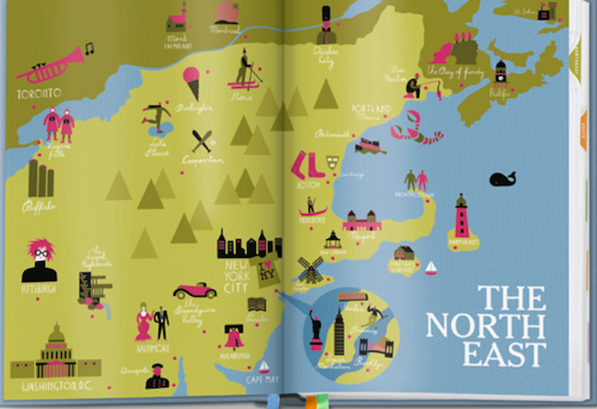
[caption id="attachment_301971" align="aligncenter" width="460" caption="Illustration for the book "The New York Times, 36 Hours" (Taschen), 2011"] [/caption]
Following the accolades she has received from her work on the Times’ iPhone app the Scoop, as well as her cover for American Illustration, Zagnoli hopes to spend more time this year on personal projects, expanding her approach to ideas and materials. “Now is the time for me to experiment with new stuff,” she says. “I’m learning how to become less literal.” And this year she got to celebrate her actual, magical birthday.
[caption id="attachment_301981" align="aligncenter" width="460" caption="Illustration for Rolling Stone Italia, 2011"] [/caption]
See the other 2012 New Visual Artists:
- Sang Mun
- Erin Schell
- Berton Hasebe
- Drea Zlanabitnig
- Casper Heijkenskjöld
- Kelsey Dake
- Jerome Corgier
- Tracy Ma
- Olimpia Zagnoli
- Ryan Thacker
- John Passafiume
- Lisa Hedge
- Jungyeon Roh
- Dafi Kühne
- Jing Wei
- Caleb Bennett
- Naz Sahin
- Serifcan Ozcan
- Brendan Griffiths
- George Michael Brower
Copyright F+W Media Inc. 2012.
Salon is proud to feature content from Imprint, the fastest-growing design community on the web. Brought to you by Print magazine, America's oldest and most trusted design voice, Imprint features some of the biggest names in the industry covering visual culture from every angle. Imprint advances and expands the design conversation, providing fresh daily content to the community (and now to salon.com!), sparking conversation, competition, criticism, and passion among its members.


Shares