When it comes to integrating images, text and video in inventive ways, some of the most promising new tablet apps have been produced by museums. It’s a logical fit: Museums are about both information and looking at things. People absorb their exhibits by wandering around, in a self-directed and often non-linear manner. And museums tend to be funded by corporations who like the idea that their investment will result in their logo being attached to prestigious content distributed all over the world, not just in the city where the museum is located. That means the apps are often free.
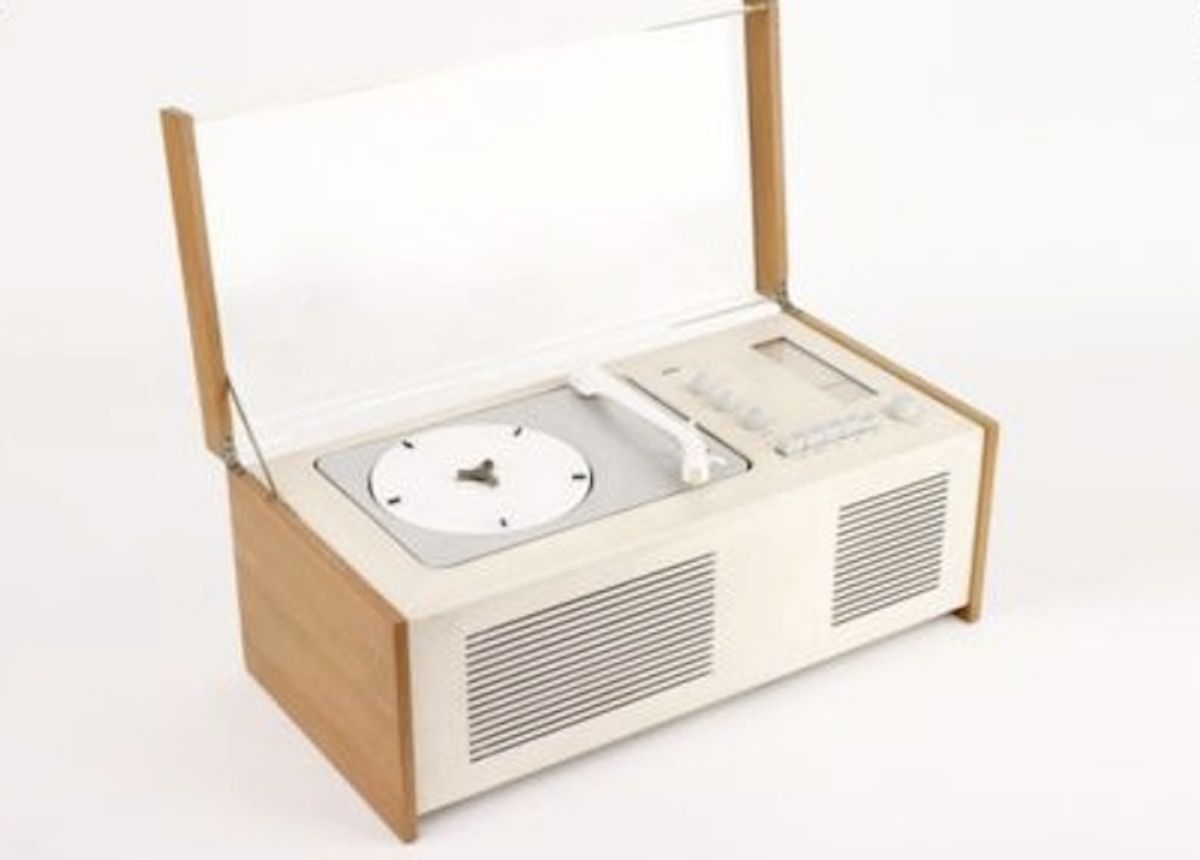
![]() The new app for the Design Museum in London is, unsurprisingly, beautifully designed. It features 59 exemplary objects from the museum’s collection, everything from iconic chairs and the original, candy-colored iMac to the first plastic-covered nappy (diaper), devised by an American housewife in 1946 and celebrated in the accompanying text as an example of ingenious “design without designers.” Others are simply beautiful.
The new app for the Design Museum in London is, unsurprisingly, beautifully designed. It features 59 exemplary objects from the museum’s collection, everything from iconic chairs and the original, candy-colored iMac to the first plastic-covered nappy (diaper), devised by an American housewife in 1946 and celebrated in the accompanying text as an example of ingenious “design without designers.” Others are simply beautiful.

The items are presented on a grid, with each column and row scrollable either vertically or horizontally. Select an object and the entry expands to reveal a gallery of photographs from various angles, text explaining the object’s provenance and the reasons for its inclusion, and a brief video of museum director Deyan Sudjic talking about why it’s notable. Although Deyan has a pleasant voice and extemporizes comfortably, the videos are the weakest part of the app because they are superfluous. There’s nothing in them you can’t already find in the text or photographs. Occasionally, they miss an opportunity, such as not including the sound of Alberto Alessi’s famous Whistling Kettle, which was designed to sound like an American freight train, and since many of these objects are praised for their functionality, it would be nice to see some of them in action.

A curious effect of meandering through the Design Museum Collection app and other forms of non-linear media is a low-level anxiety that you might miss something. In a physical museum, you can poke your head in every room and assure yourself that you’ve covered all the exhibit territory in the building. Every so often, using the Design Museum app, I found myself scrolling an interesting object off the main page and then not being able to find it again. (The scrollable “strips” seem to change their composition when you move in and out of an entry.) Where was that weird-looking TV, again? Eventually, I found it, but this nagging sensation of incompleteness is something nonlinear-media creators need to bear in mind. The idea is to make art and information accessible to an audience in new ways, not (or at least not always) to make them wonder if it’s been withheld.
Finally, while I’m leery of the mania for injecting social media elements into every cultural experience, I love that the Design Museum app supports comments on every single entry. The objects were all designed to be used, and it’s delightful to read accounts (both laudatory and derisive) of what it’s like to live with them.


Shares