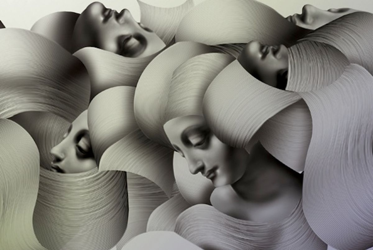
 Lisa Hedge spent her first New York winter in Long Island City, working for Takashi Murakami’s studio, Kaikai Kiki, mixing 3,000 shades of green paint. “It was an insane design experiment in a way,” she says. “Matching what we were mixing to the swatches, making little samples, creating rules for ourselves. We finished the painting about when I left, and then it went to Gagosian.” Hedge went freelance, doing design work for L’Oreal, then to Tender, where she worked on corporate jobs like banner ads and branding. But an artist’s instincts are hard to wash off. Getting out brushes and scissors is, for her, “a natural starting point. Until I realize, Oh, wow, I need to get something into Illustrator.”
 Age: 27
Senior Designer, Partners & Spade
From: New Plymouth, New Zealand
Lives in: New York City
Website: http://cargocollective.com/lisahedge
Michael Freimuth, Tender’s design director while Hedge was there, says, “She’s as comfortable with digital illustration as with entirely analog, tactile work like cutting up paper.” Hedge remembers being teased for having pages of writing on her desk―sketches, ideas, false starts―and a blank screen. “But for me, it’s a thinking process,” she says. “It’s important to see the realization of your ideas outside of the screen. The most interesting designs come from a period of exploration, playing around with materials.”
[caption id="attachment_306091" align="aligncenter" width="460" caption="Poster for the Association of Hispanic and Black Business Students, NYU, 2011"] [/caption]
[caption id="attachment_306101" align="aligncenter" width="460" caption="Howls illustration, 2011 (personal project)"] [/caption]
[caption id="attachment_306111" align="aligncenter" width="460" caption="Lowlands illustration, 2011 (personal project)"] [/caption]
And indeed, Hedge’s best work is often the first pass: natural, rough, organic. Like the floral letterforms she drew for a cosmetics branding project (before they were pruned into Nobel and Futura) or the slivers of a paper map, pushed together into waves (before the poster, for an NYU student organization, turned crisp and vectored). Her background is in art―Hedge studied studio and design at USC―and though the intimacy of her creative process harks back to those studio days, she thinks like a designer. “Sometimes with fine art,” she says, “I get trapped into thinking, What’s the personal significance of all this? Design helps push me toward an audience. Fine art is so singular, but with design you’re motivated by how the ideas are received.”
[caption id="attachment_306121" align="aligncenter" width="460" caption="Modern Day poster (personal project), 2011"] [/caption]
[caption id="attachment_306131" align="aligncenter" width="460" caption="Letters to Liz (personal project), 2011"] [/caption]
[caption id="attachment_306141" align="aligncenter" width="460" caption="Stationery for Marweather, 2011–2012."] [/caption]
Copyright F+W Media Inc. 2012.
Salon is proud to feature content from Imprint, the fastest-growing design community on the web. Brought to you by Print magazine, America's oldest and most trusted design voice, Imprint features some of the biggest names in the industry covering visual culture from every angle. Imprint advances and expands the design conversation, providing fresh daily content to the community (and now to salon.com!), sparking conversation, competition, criticism, and passion among its members.


Shares