“My father’s family name being Pirrip, and my Christian name Philip, my infant tongue could make of both names nothing longer or more explicit than Pip.” Those lines may not be as recognizable as “It was the best of times, it was the worst of times,” but they are nevertheless part of the literary canon, the classic opener to Charles Dickens' "Great Expectations." On the first page of the novel, our narrator, Pip, one of literature’s great rapscallion ragamuffins, is examining the carvings on the headstones of the parents he never met, trying to glean some sense of them.
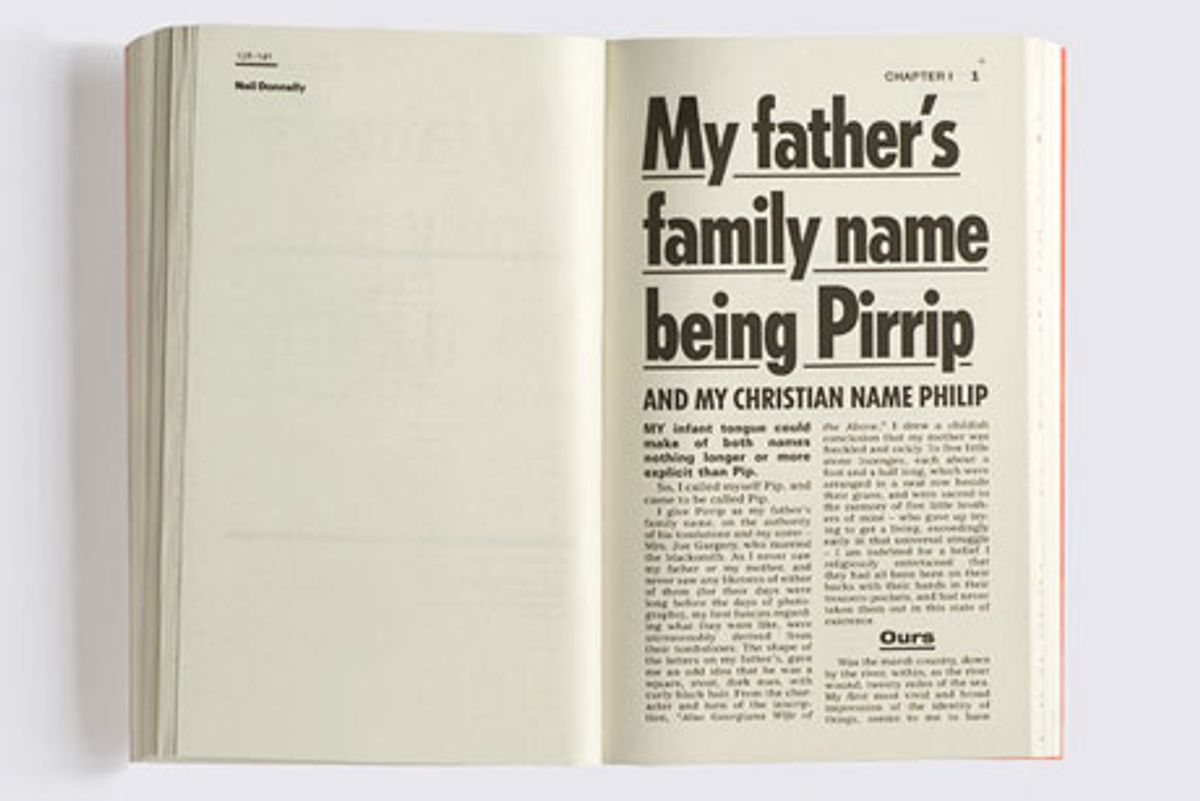
Pip’s earnest attempt at what we might call "imaginative typographic genealogy" gave the folks at GraphicDesign& the idea for Page 1: Great Expectations, in which 70 international graphic designers have a go at designing the first page of this classic bildungsroman. Why solicit designers—and this book is chock-full of heavy hitters like Phil Baines, Robin Kinross, Ellen Lupton, and Erik Spiekermann—to apply their craft to a novel that already exists in countless editions? Because Pip’s search for knowledge begins with the shape of letterforms, making the book a fitting choice for a redesign. The new book has page after page of every design pose you can imagine—from the punched-up tabloid point size employed by Neil Donnelly to Barnbrook’s infographics take. So what do we really make of this book dedicated to the first page of another book?
[caption id="" align="aligncenter" width="504" caption="Neil Donnelly, via GraphicDesign&"] [/caption]
Here’s how GraphicDesign&; describes the project: “Page 1 is not just a book for graphic designers, it reveals the power typography has to influence and affect the way we all interpret a text. Many readers will be surprised by the attention to detail and level of engagement with the narrative on display, and aficionados of Dickens will be charmed by the idiosyncratic approaches to this much-loved text.”
[caption id="" align="aligncenter" width="504" caption="Winterhouse, via GraphicDesign&;"] [/caption]
Of course, anyone familiar with design, especially design rendered by the likes of these contributors, will not at all be surprised by their “attention to detail and level of engagement” with the text. That’s what designers do. Some of these first pages are approached in a very classical, tasteful manner, while others use a close reading of the text to create clever typographic puns. Wallpapers*’s Tony Chambers isolated “Pip” on the top of a second column of text, using an orphan for the orphan.
[caption id="" align="aligncenter" width="504" caption="Yu Kin Kang, via GraphicDesign&;"] [/caption]
Unlike most books that deal with Dickens, this is not a volume you read; rather, this is a collection to be looked at. In truth, it really isn’t a book about Dickens or "Great Expectations." It's a study in graphic design and how it varies under the strict imposition of content, not form. Seeing this first page treated differently page after page starts to come off as a gimmick, however, which is a great disservice to the designs, which are all well-executed in their own way. At times, though, the project goes against an invaluable tenet of graphic design: Don’t distract from the content of the design. The exercise in this collection makes the text secondary, especially in light of some of the flashier treatments.
[caption id="" align="aligncenter" width="504" caption="Barnbrook, via GraphicDesign&;"] [/caption]
There is no doubt that, as Graphicdesign& points out, typography influences how we understand a text. Wouldn’t it be more interesting to create a project in which a single designer shows how she or he would design the first page of every novel Dickens wrote? Inviting designers to render the first pages of a major author’s oeuvre would not only make for a fascinating look at the creative processes; it might also show something about the author’s writerly habits in starting books. Perhaps what it revealed would be something that not even the most astute literary critics had yet uncovered.


Shares