 I was surprised the other day to find settings in iTunes and the radio-streaming app Stitcher that allow users to play a podcast at up to two times the normal speed. I tested them and discovered that, yes, NPR hosts speak slowly. But do we really not have time to listen to a pause for breath, or a moment’s quiet contemplation of a thoughtful response?
Then again, reduction and compression can also be done in a thoughtful way; certainly, designers constantly rely on reduction to inform our work. Logos and app icons require extreme simplification of an idea. From a perfectly composed tweet to a book cover, there's an undeniable art to brevity. Even when a particular designer's work seems to favor complexity, it's often an aesthetic judgment; the designer is choosing to reveal a select part of the spectrum from simplicity to complexity. Some of the greatest "maximalists" of our time show great restraint of concept.
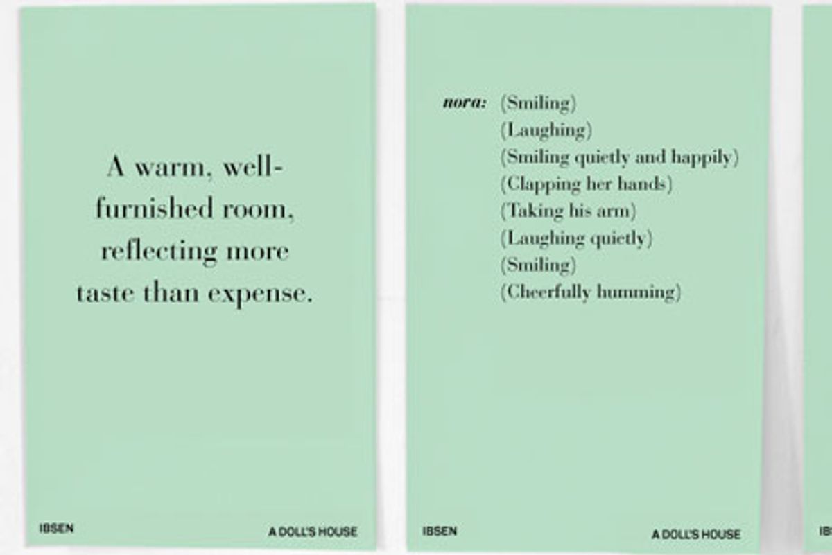
In my own work, I always try to exercise this design "muscle" of reduction, whether in form or in concept. As an example, here's a recent experiment: I wondered, was there a stronger narrative of the actions of a character onstage than a play's actual dialogue? I chose to examine stage directions to begin to see if this shorthand — of plot and character — could stand alone.
I began by revisiting a favorite play. Henrik Ibsen’s "A Doll’s House" traces the protagonist, Nora's, transformation of self. She begins as a seemingly vacant, cheerful housewife. As the story progresses, however, she gradually gathers enough clarity to leave her family and routine life.
In this reduction experiment, we can see Nora’s complete character arc within seven broadsheets. Stage directions are “how” the performer is to perform actions. Bertolt Brecht, the grandfather of theater criticism, believed the playwright should use gestural language to compel the actor to conform to the playwright’s idea of how the play should be acted. Tone of voice and gesture can convey so much more than the actual words spoken.
The broadsheet experiments became fragmented poetry. The reduction became, perhaps, more illuminating of Nora's character than the full text of the play.
She transforms from
(Smiling)
(Laughing)
(Smiling quietly and happily)
(Clapping her hands)
(Taking his arm)
(Laughing quietly)
(Smiling)
(Cheerfully humming)
to
(Pale with terror)
(Comes forward)
(In a horror stricken voice)
(Recovering herself)
(Looking at him anxiously)
(Rises deliberately)
(Faintly)
(Quickly)
Have others tried similar exercises in design reduction? If so, please share them in the comments.
.
For more on useful design exercises, check out Von Glitschka's upcoming webinar on improving your design through drawing, taking place next Thursday, July 19, at 2 p.m. EST.


Shares