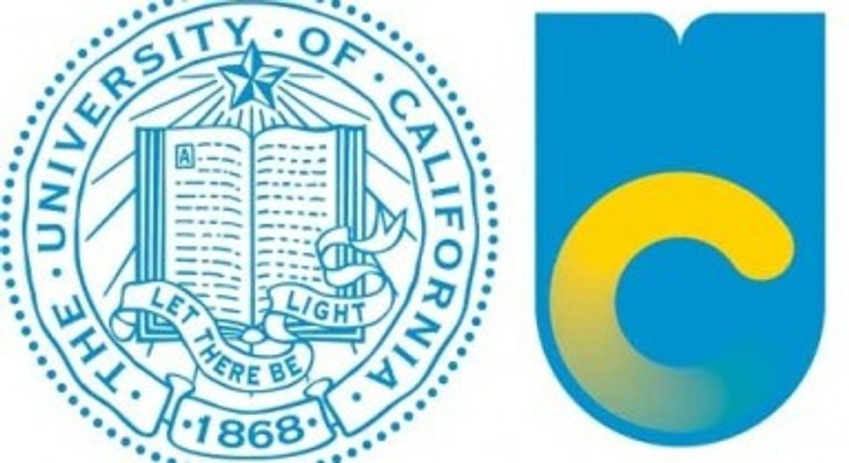
"It's not only ugly because it looks like a Swedish flag being flushed down the toilet," wrote New Inquiry blogger and University of California doctoral candidate Aaron Bady of his university's brand-new logo, "it’s ugly because it so perfectly crystallizes everything that’s been going wrong with the University of California for years."
U.C. recently unveiled its new logo. Gone is the traditional arrangement, centering on an open book adorned with the institution's founding date. The new logo features instead a simple yellow, almost Comic Sans style "C" -- or perhaps it's a swish? -- on a sky blue "U" background. An 11-person team spent three years developing the logo, which aimed to project a "forward-looking spirit" according to U.C. officials cited in the L.A. Times.
However, the logo has yielded a 95 percent unfavorable result in an Oakland Tribune poll, while, as the L.A. Times points out, the university has been met with an "online revolt complete with mocking memes, Twitter insults and a petition to restore the old logo." But as Bady notes, the intentions behind the image update had little to do with pleasing university students and staff, but rather aimed to appeal to the California governor and big tech corporations for funding by presenting the academic institution as a hub for the area's start-up scene. "They really are trying to rebrand the university to resemble a flavor-of-the-month startup," wrote Bady. Via the New Inquiry:
Who knows how much this cost. But be reassured, Californians, it’s not your tax dollars at work, here, and that’s kind of the point. Your opinions matter only the shrinking percentage of the university’s budget that the state actually pays for, down from $16k per student in the 1990’s to less than $7k today, and still falling. The state needs that money for building new prisons, for keeping property taxes low, and for not charging vehicle registration fees. But that’s why the state isn’t trying to impress its citizens, isn’t it? It’s appealing to the tech industry, signaling its desire to hook up for the night with all the subtlety and finesse of a 17 year old at a frat party. It even makes a certain kind of sense: instead of serving the public good by educating students, the university’s fiscal strategy is now a matter of attracting donations and customers, so image and advertisement are the important things.
The L.A. Times cited "marketing and design experts" who said that "emotional responses are common when institutions change their marketing images" to account for much of the student body's disdain for the new image. There is no doubt some truth to this brand loyalty explanation, but it fails to account for what the logo shift actually seems t0 symbolize; the new logo represents explicitly a business and an investment opportunity, not an place of research and learning.
The student body's collective outcry over the logo does, however, offer hope for those concerned about creativity among today's young people. Social media networks are awash with détourned U.C. logos, including the image below, courtesy of the Boston Review, featuring the famed "pepper-spray cop" who doused students at Occupy U.C. Davis:


Shares