Election Day 2017 seems to have gone smoothly.
There were few contests of major consequence and turnout was low – with Virginia the most notable exception. Election integrity – the extent to which the outcome of the election matches the will of the voters – was not an issue in the news.
Things could, however, be different in 2018. Concern over election integrity could become amplified if turnout is high and margins close. Given the stakes in the 2018 midterms – now less than a year away – and other concerns such as widespread reports about Russian hacking, now is the time when election officials must begin the critical work of ensuring the integrity of the vote.
When most people think about threats to election integrity, security and fraud are the primary concerns. For example, were the ballots or the election totals hacked? Were ballot boxes stuffed? Were there ballots cast by people who were not eligible to vote?
However, there is another threat to election integrity that has received increasing attention from election officials and researchers like me over the past dozen or so years: voting system usability. That is, does what actually gets recorded on to the ballots accurately reflect the will of the voters?
All the security in the world means little if ballots are inaccurate.
But how could what’s on the ballots themselves be wrong?
Good design is critical

AP Photo/Wilfredo Lee
Incorrect ballots happen when the ballot itself is badly designed and that poor design leads voters to make errors.
While concerns about voter fraud are mostly unfounded, major elections – including one U.S. presidential election – have almost certainly been decided by poor ballot design. In 2000, Palm Beach County, Florida deployed a now-infamous “butterfly ballot” with a two-column design that caused thousands of likely Al Gore voters to either cast a vote for Pat Buchanan or cast an invalid ballot.
In that same election, Duval County, Florida saw over 20,000 votes in a highly Democratic county thrown out because the presidential race was split across the front and back of the ballot, and voters voted on both sides.
Either one of these poorly designed ballots alone would have tipped the state of Florida, and thus the presidency, as Gore lost Florida by fewer than 400 votes.
Similarly, a combination of poor screen layout and an unsophisticated computer touchscreen interface likely turned the outcome of a U.S. congressional race in Sarasota, Florida in 2006.
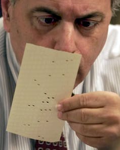
Even apparently well-designed paper ballots are not immune to problems. Thousands of ballots were contested in the 2008 Minnesota Senate race, many of them thrown out because voters attempted to correct mistakes on their ballots rather than making the effort to get a new one. Whether these errors determined the result is unclear, but the state and the candidates spent substantial time and money sorting out the outcome.
The point is that even well-designed paper ballots can produce error rates of about 1 to 2 percent, which is larger than the margin of victory in many elections. It is highly unlikely that deliberate bad design is what occurred in any of these historic cases. Bad design usually results from a lack of understanding of good design, not ill intent. For example, in Palm Beach County in 2000, the poor ballot was actually designed by a Democrat, certainly not someone trying to defeat Gore.
Rather, the problem is that good design is difficult and requires deep understanding of how people interact with technology. There are academic disciplines devoted to studying how to make things usable, as well as active research in many corporate and government labs. Historically, little of this work has centered on voting, but the 2000 presidential election served as a catalyst for change on many fronts.
Spending too fast?
Wanting to avoid a repeat of the problems in the 2000 presidential election, Congress in 2002 passed the Help America Vote Act, which not only created the federal Election Assistance Commission to set standards, but allocated billions of dollars for local jurisdictions to purchase new voting equipment. Unfortunately, these purchases preceded the relevant science.
Despite the fact that systems like punch cards, lever voting machines and paper ballots had been in use for decades, there had been almost zero research on how usable these systems were prior to 2005. Computer voting systems purchased with Help America Vote Act money were deployed in the early 2000s with no idea whether they were better or worse than the technologies they replaced. We have since learned that paper ballots were the best legacy technology, as paper ballots are generally superior to lever machines and punch cards. Unfortunately, most computer voting systems are also worse than paper in terms of error rate.
Many jurisdictions that switched from paper to computers likely made things worse for the voters. Most commercial computer voting systems also suffer from many well-documented security flaws, which are compounded in many cases by lack of a paper record.
Unfortunately, even paper is not an ideal technology. Paper ballots are a poor choice for accessibility. They are particularly challenging for voters with visual and motor impairments. Paper ballots are also logistically difficult for election administrators, especially in large jurisdictions that have to deal with many ballot styles and multiple languages.
The good news is that it is possible to design computer interfaces that are superior to paper. This requires careful design by usability experts and a commitment to multiple cycles of usability testing during the design process. While the systems that were available for election officials to purchase in the early 2000s did not meet this standard, careful design and usability testing of voting systems is now starting to happen. In fact, it is local election officials who are leading the way.
In Los Angeles County – the most populous county in the U.S. – the county clerk came to the conclusion that none of the commercially available systems met the needs of his voters and the county embarked on an ambitious multi-year design process.
Information used in the design of LA County’s voting system was gathered from many stakeholders. A professional design firm was contracted, with oversight from a technical group made up of experts from many relevant disciplines, including usability, security, election administration and technology policy. While this system is computer-based, the computer produces a paper record that voters can verify before casting their vote.
The county clerk in Travis County, Texas – with input from usability experts – is also leading an effort to design a voting system with even more sophisticated security mechanisms.
![]() While these efforts are an important start, differences in local election laws, customs and budgets means that it is unlikely that a “one size fits all” system will be developed that would be effective everywhere. Voting is much more complicated than it appears on the surface. There are over 3,000 counties in the U.S., and each one is unique. What is critical is that each jurisdiction treat usability as an essential concern and seek out expertise to protect election integrity.
While these efforts are an important start, differences in local election laws, customs and budgets means that it is unlikely that a “one size fits all” system will be developed that would be effective everywhere. Voting is much more complicated than it appears on the surface. There are over 3,000 counties in the U.S., and each one is unique. What is critical is that each jurisdiction treat usability as an essential concern and seek out expertise to protect election integrity.
Michael Byrne, Professor of Psychology and of Computer Science, Rice University


Shares