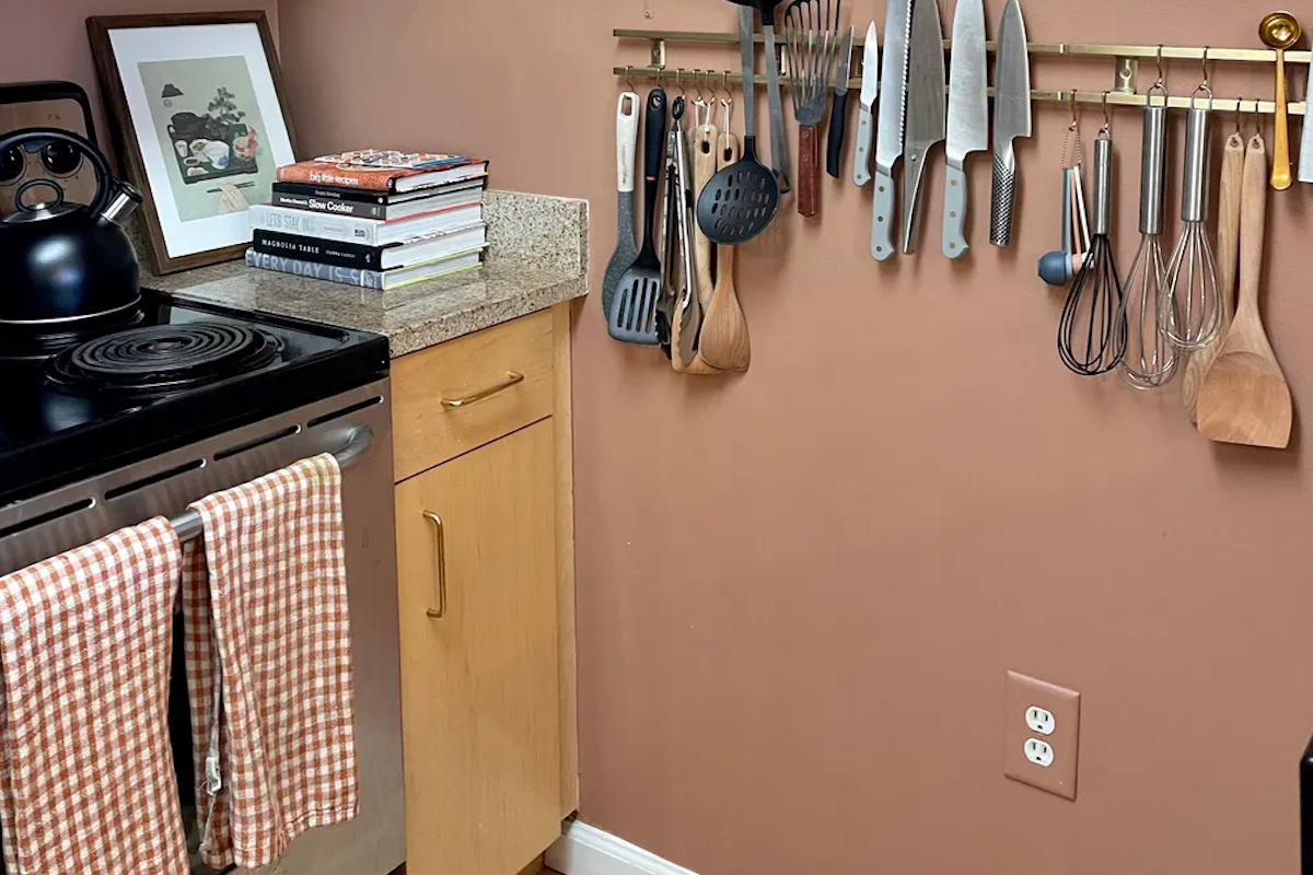
My current rental's kitchen has builder's grade maple veneer cabinets. When I first saw them, I knew I wanted to cover them up with black contact paper (I am a renter, after all). But once my partner and I moved in, I realized they weren't so bad at all and surprisingly, were in decent condition compared to other apartments I've rented. I no longer had grand plans to change how the cabinets looked, but I still wanted to change up everything around them: swapping out hardware, painting the walls, adding a rug, changing lighting. Even the ugliest kitchens (and yes, that is in the eye of the beholder) can be saved with a little thoughtful accessorizing.
With that in mind, I went ahead and swapped out the nickel hardware for brass, painted the walls a complementary color, and what do you know? I actually like the cabinets now. So, the best advice I have is to lean into the material and don't try to force-fit a design style that simply won't work. For instance, if you have traditional-style cabinets, adding lots of modern accents can make them feel even more dated, and vice versa. Plus, if your cabinets aren't all that bad, why not spend your time and money elsewhere in your home?
Below, we've gathered eight common cabinet materials, and ideas for how to work with — not against — them.
Knotty pine cabinets or the like
Pine gets a bad rap. It's an affordable soft wood, instantly recognizable by its many dark knots that are characteristic of the grain. Its biggest offense is its knack for yellowing and orange-ing (?) over time, making it look less rustic-cool and much more colonial log cabin. If this is your thing (say, you have a home in the woods), lean into it. The owners of the above kitchen did just that by not following any real "rules," instead putting all their eclectic wares on display. Now, the room feel less outdated and more curated — a cozy little cabin that gets lots of love.
Reddish-brown wood cabinets
This kitchen combines rustic wood cabinets with matching open shelves that house an array of cooking supplies, books, and knickknacks in retro hues like seafoam green. If you're unable to remove the top cabinets to make way for open shelves, just take the doors off to achieve a similar vibe. The room works because instead of fighting with the wood tones, it meets them where they are, leaning heavily into a cottage-y vibe.
Light wood cabinets
Light, neutral-toned wood (read: not too yellow or orange) is one of the easiest wood tones to work with because it's kind of like a blank canvas. Some people are afraid to mix wood tones, but I say go for it. If mid-century walnut and teak are your favorites, don't be afraid to mix them in as accessories. The above kitchen is my own, and since the cabinets were so neutral, I went with a bold wall color (this is Minestrone by Behr), and swapped out the original nickel hardware for brass. These changes make the cabinets feel more intentional, instead of something I had no choice but to work with.
Dark, deep wood cabinets
The '70s are back in a big way, as evidenced by the resurgence of psychedelic floral patterns and retro appliances. This kitchen works with low-profile, dark wood cabinets by pairing them with a bold chartreuse backsplash, brass hardware, and a saturated salmon rug. Let this be color inspiration for the kitchen you have and apply it to art, countertop accents, hand towels, wall paint, and more.
White cabinets
Congrats! If you have white cabinets, you have a totally clean slate for whatever your heart desires, even if a white kitchen isn't your thing. It's all about the finishes and the accessories here, so go wild or go simple, it's up to you. Luckily, we've rounded up all the best ways to make a white kitchen shine right here.
Orange-tinted wood cabinets
My previous apartment had a kitchen I absolutely hated for a long time. Cheap, orange-y cabinets were offset by laminated countertops and equally low-quality floor tile. Such is life in a New York City apartment. One major change I made, though, improved the entire space: I painted the walls green. Instantly, the cabinets that looked so orange next to a stark white wall actually felt charming and balanced out by the cool-toned hunter green. I also swapped out bright decor for more neutral tones and added gingham hand towels, which contributed to the cottage-y vibe.
Retro and laminated wood cabinets
I've never seen someone successfully make this style of cabinet look chic, but then I happened upon this photo. The emerald green tile, trailing plants, and considered artwork all make the space feel cohesive. You'll notice that they also chose to remove the cabinet doors from the top level, creating open shelving where it didn't exist before.
Black cabinets
While you might think that black cabinets are harsh or stark, they're actually very easy to warm up to feel more cozy and sophisticated. Take the above kitchen, for example, which employs some of the simplest, most classic materials to great effect: white subway tile, brass hardware, and butcher's block counters. While you might not want to install a whole new counter, things like wooden shelving, a peel-and-stick backsplash, and updated hardware are all quick fixes.


Shares