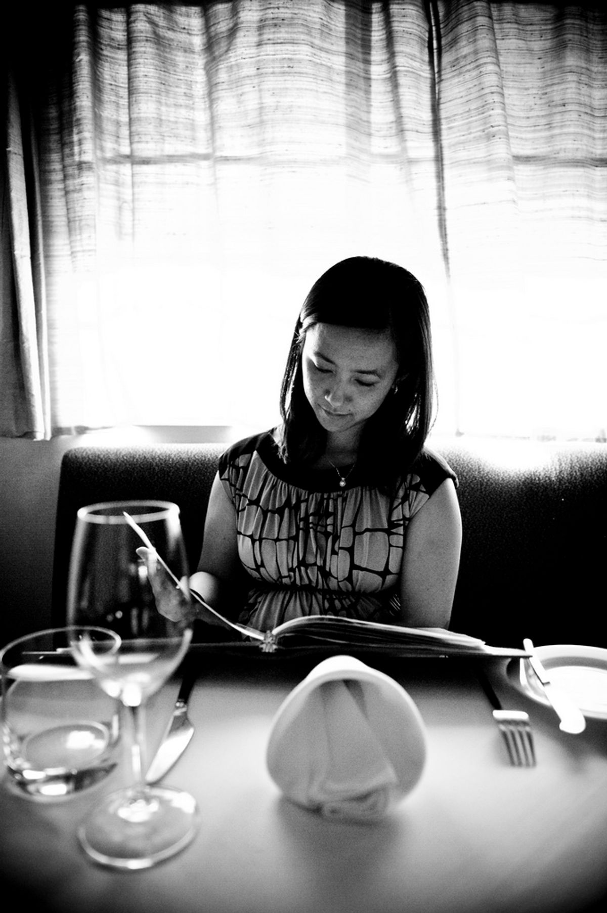
This past Saturday morning, the buttery sound of Lynne Rossetto Kasper's words stopped me in mid-breakfast. On her radio show "The Splendid Table," she spoke of menus being "invitations to pleasure," and there was something in that, with the sun streaming through my friend's window, that sounded wonderful and right. But her guest was William Poundstone, author of "Priceless: The Myth of Fair Value and How to Take Advantage of It," and he talked about how restaurants use menus to manipulate you into spending more money than you intend.
"Menus," he said, "are supposed to be the classic example of free choice, but menu designers have found that there're many ways of getting you to order what the restaurant wants you to order" -- the most profitable dishes, presumably.
The techniques he laid out are fascinating: a box drawn around certain items, for instance, always draws the eyes -- and attention -- there. This might mean these dishes best highlight the kitchen's skills, or, more likely, they make the restaurant the most money: The ingredient cost is low, or maybe they take the least staff time to prepare.
But, more subtly, the box might not simply be encouraging you to order whatever's in it. "There are places where there's a $150 hamburger," Poundstone said. "The first thing everyone does is shake their head. But then you go down the menu, suddenly the $50 steak doesn't seem so outrageous." Our sense of value is always relative, and a technique like this, which gets you over your sticker shock early, can skew that sense just enough for you to find yourself saying, "I'll have the steak medium rare, please."
Similarly, when a menu offers a choice between portion sizes, the more expensive large will make the small seem like a better deal. Poundstone suggests that the smaller size is often the more profitable one, but I'm not sure. You have to account for staff time -- it takes just as long to cook a half-plate of pasta as it does a full one, for instance -- and, of course, exactly how much more food the cooks are putting in the large order. But still, the savviest restaurateurs know that having a larger, more expensive version of a dish makes the small one seem like a good deal, and they'll make sure, small or large, it's a high-profit item to begin with.
As he spoke, I recalled the lessons I learned on menu layout in culinary school, most of which revolved around the Prime Objective: make people forget about money. Round to the nearest dollar and skip the cents, avoiding more numerals that can draw attention to the cost. Don't align the prices at the right side of the page, causing people to run their eyes down the column and compare numbers without even reading the menu items. (And lines that lead the eyes from the item to the price are a mortal sin in the eyes of Mammon.) Knowing that the eyes hit the upper right side of a menu first upon opening it, savvy designers will put the items they want to push in that area, so they catch your attention first. They'll bury the ones they don't want to feature -- the ones that don't make money, or the ones that just sell themselves without any help -- below those. If it's a two-page menu, you will go back and read the entire left page, take another look at the top right, and by the time you get to the middle and bottom of the right page, your attention is probably fading. So that's where they bury the items that they don't mark up that much or dishes like the steak, because the guy that's going to order the steak is probably going to order the steak regardless of where it is. And all this strategy is before we even get to menu wording, which is another art in itself.
At the end of the interview, Kasper gave a chuckle and said, "Ah, nothing like being a victim at the restaurant." It was a gentle joke (can anything said in her hot cocoa voice sound harsher than a mild chiding?), but we, the Masters of our Destiny, always bristle at the idea of being manipulated, and I wondered about the fairness of her insinuation.
The first rejoinder of course is that restaurants are not dinner parties; they're businesses trying to make money. But looking over my vast collection of menus, ones slipped under my door by delivery boys, I see none of these design techniques, but plenty of extra decimal places and right-justified numbers. And I realized that it's a certain type of restaurant that has resources to expend on menu psychology.
The fact is that these sorts of restaurants are selling you more than a full belly. They are selling you an experience, an entertainment, a fantasy of your life as expressed in a meal. And what meal tastes better when you're busy calculating how much each bite is costing you? Of course, people have their budgets to follow, and ones with tight budgets are likely going to be extra vigilant of how much they're spending regardless of subtle design tricks. But once they've committed their money, shouldn't they also get the most out it by enjoying the night without worry?
There is an important distinction between saying that these menus are hiding their prices and saying that they are helping you to focus on the food when making your choices. The former is cynical. The latter gets you excited for what's going to come, looking forward to the evening unfolding before you. There's something every smart restaurateur knows: Make your business feel like a dinner party, and people will come back. And pay again.


Shares